Client
This font is self-initiated for distribution on the Lift Type foundry
Category
#
#
#
About the project
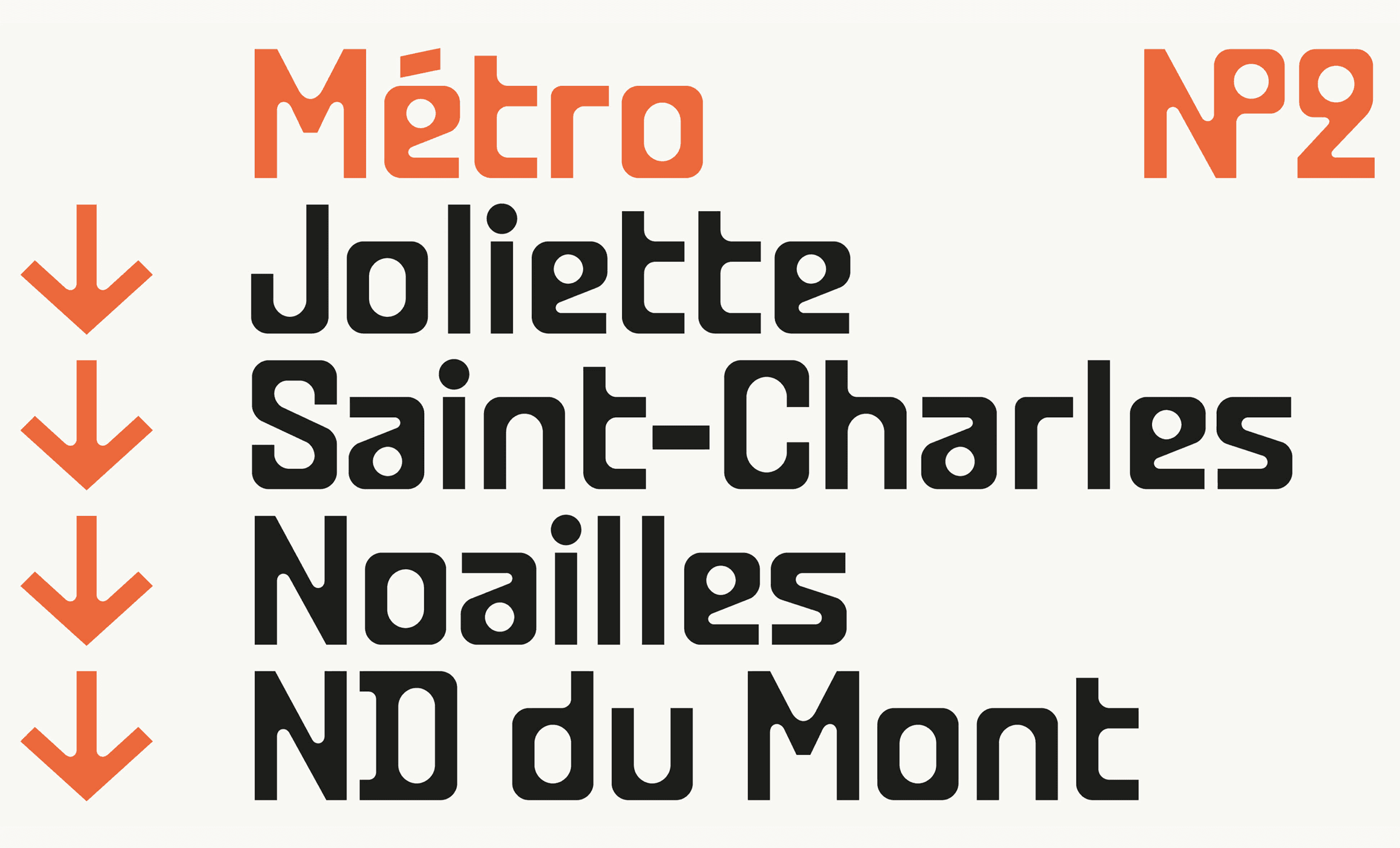
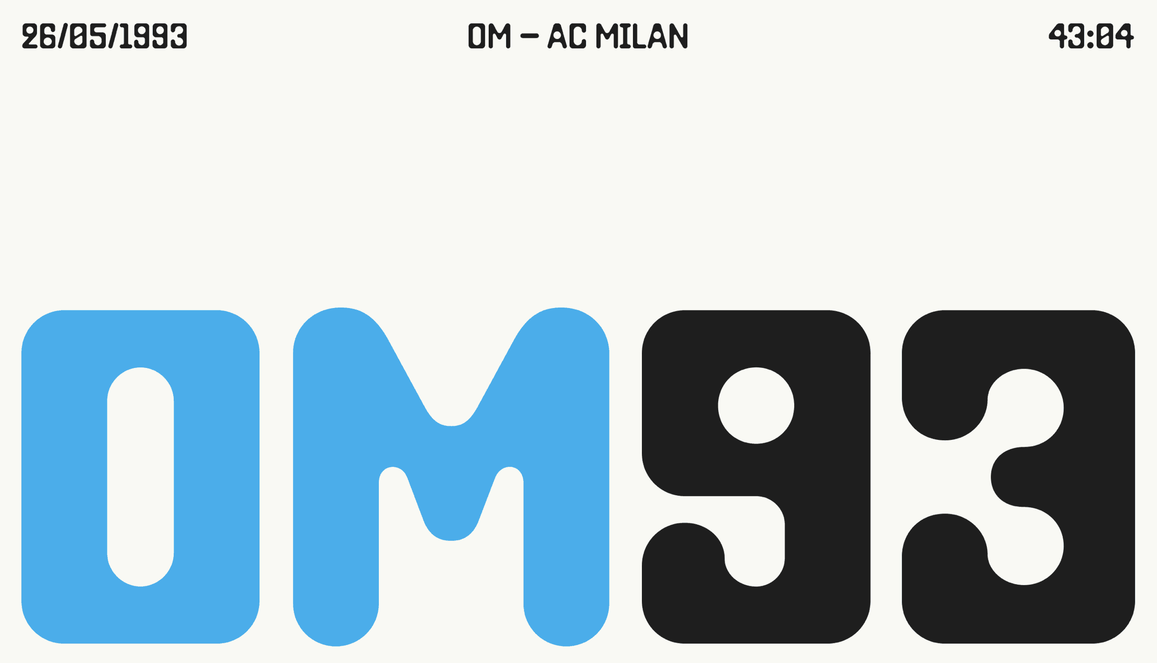
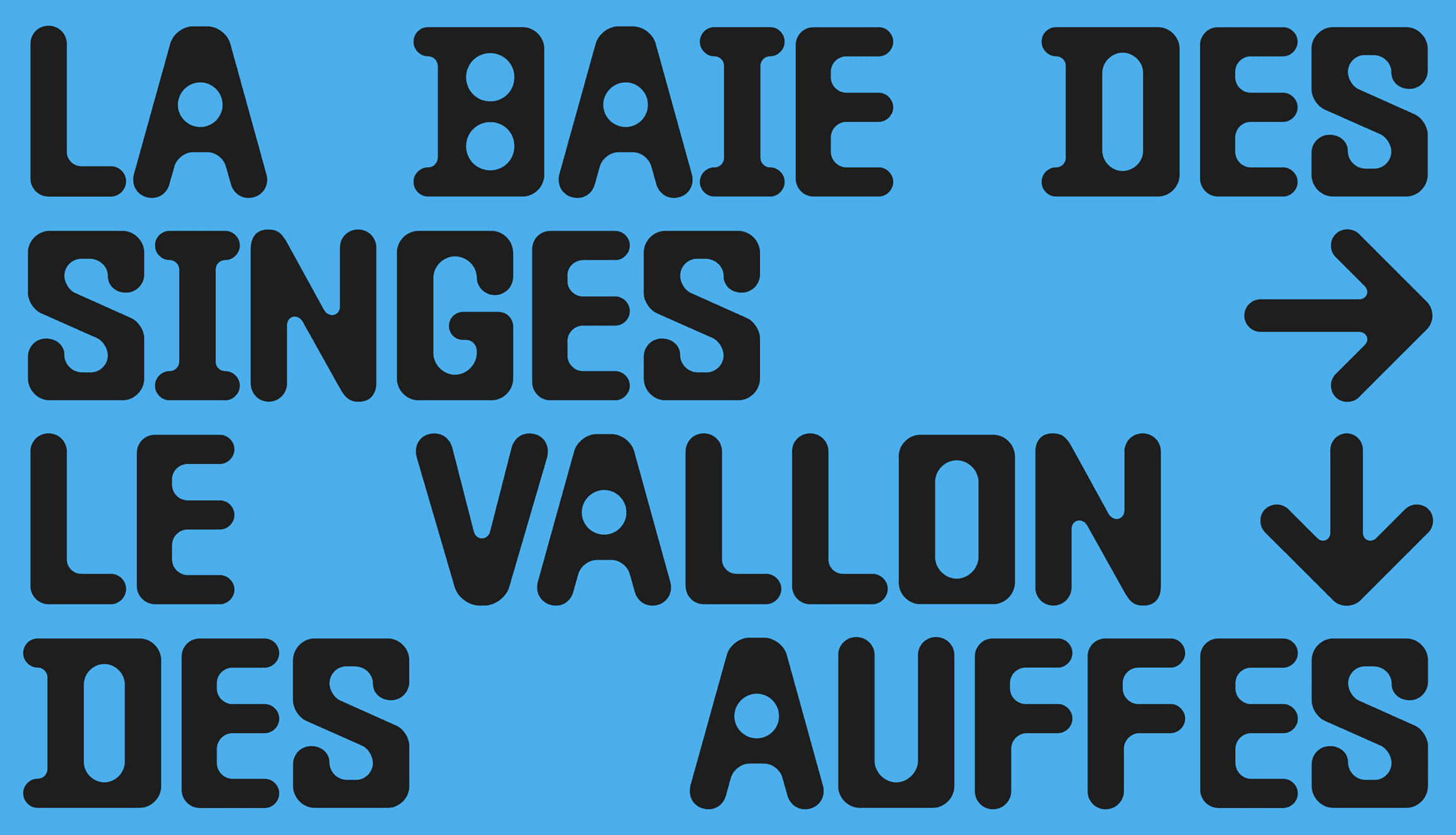
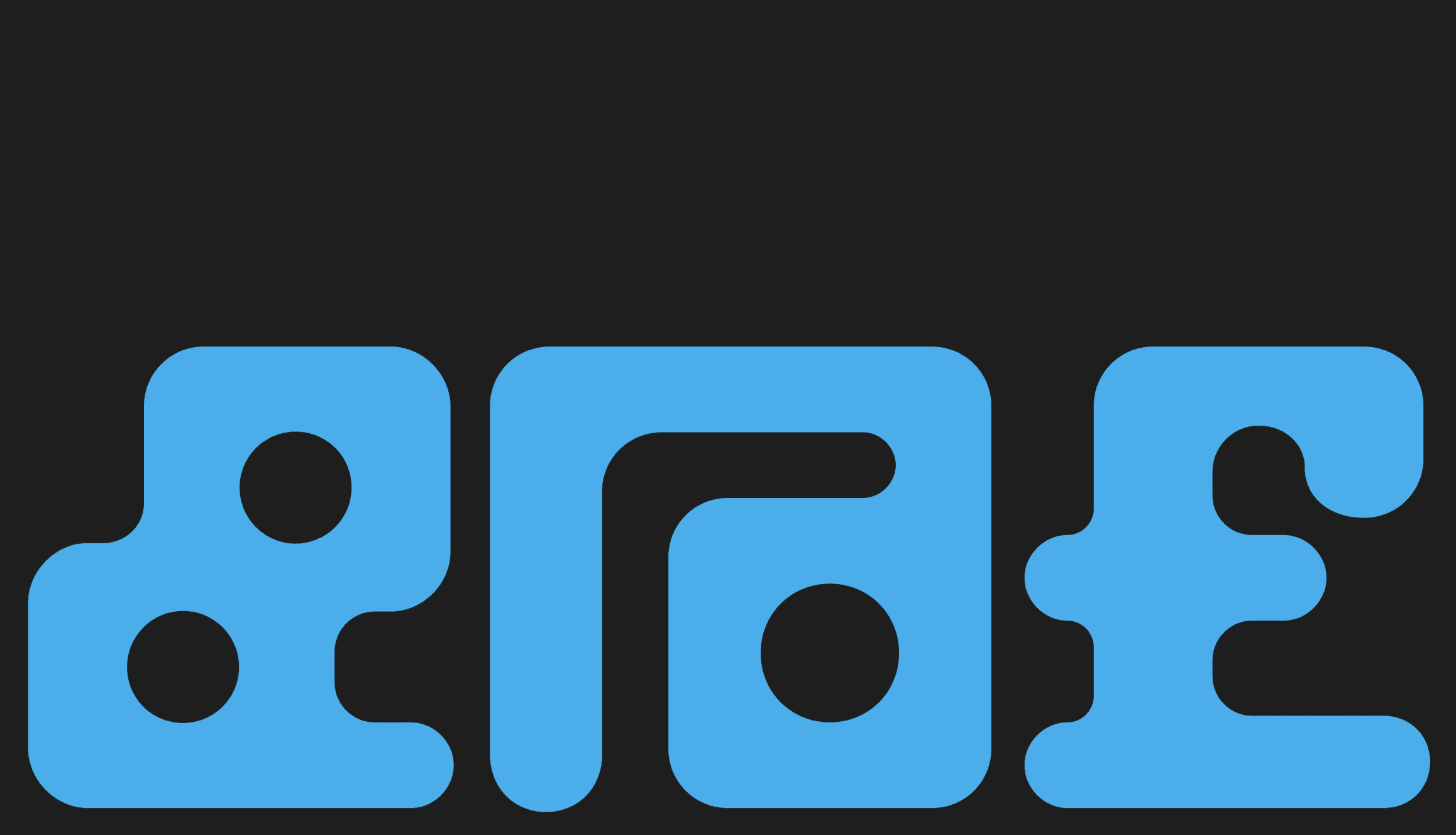
Baste is a typeface inspired by the south of France: raw and popular. Through its A and B versions, Baste explores the vernacular aesthetic and alternates between the softness of the seaside and the radicalness of an arid downtown.
What sparked this project?
Baste arose after Johan (from ImageFormat) moved from Paris to Marseille in the summer of 2022. When living in the city, he found himself encountering artisanal typography across the city. Marseille is a very grassroots city and its downtown area is full of handmade shop fronts and signs made by people who are not professional type designers. This results in some very interesting visual accidents.
Who was on the team for the project?
Type design and art direction: ImageFormat Project management: Romain Oudin and Lift Type
Do you have some project metrics to share?
The project was created over a period of between 6 months and a year. From the beginning of the type design, development and graphic creation for the communication.
What is your approach to working on a project like this? Do you follow a specific process or framework?
With this type of typographic project, the first step is to set up a few letters to highlight and validate a general graphic and rhythmic intention. The graphic system must then be validated by checking that it applies to a complete alphabet, and to an aesthetic that can be applied to a complete set, from all letters, lowercase and capital, to numbers, punctuation, accents... which generally requires adjustments and modifications.
What did the early versions of this project look like? What did you learn from this v1?
The first version didn't include the 2 versions A and B, so this alternative version was added as testing progressed.
What was the biggest challenge? Did any part of the project make you step out of your comfort zone?
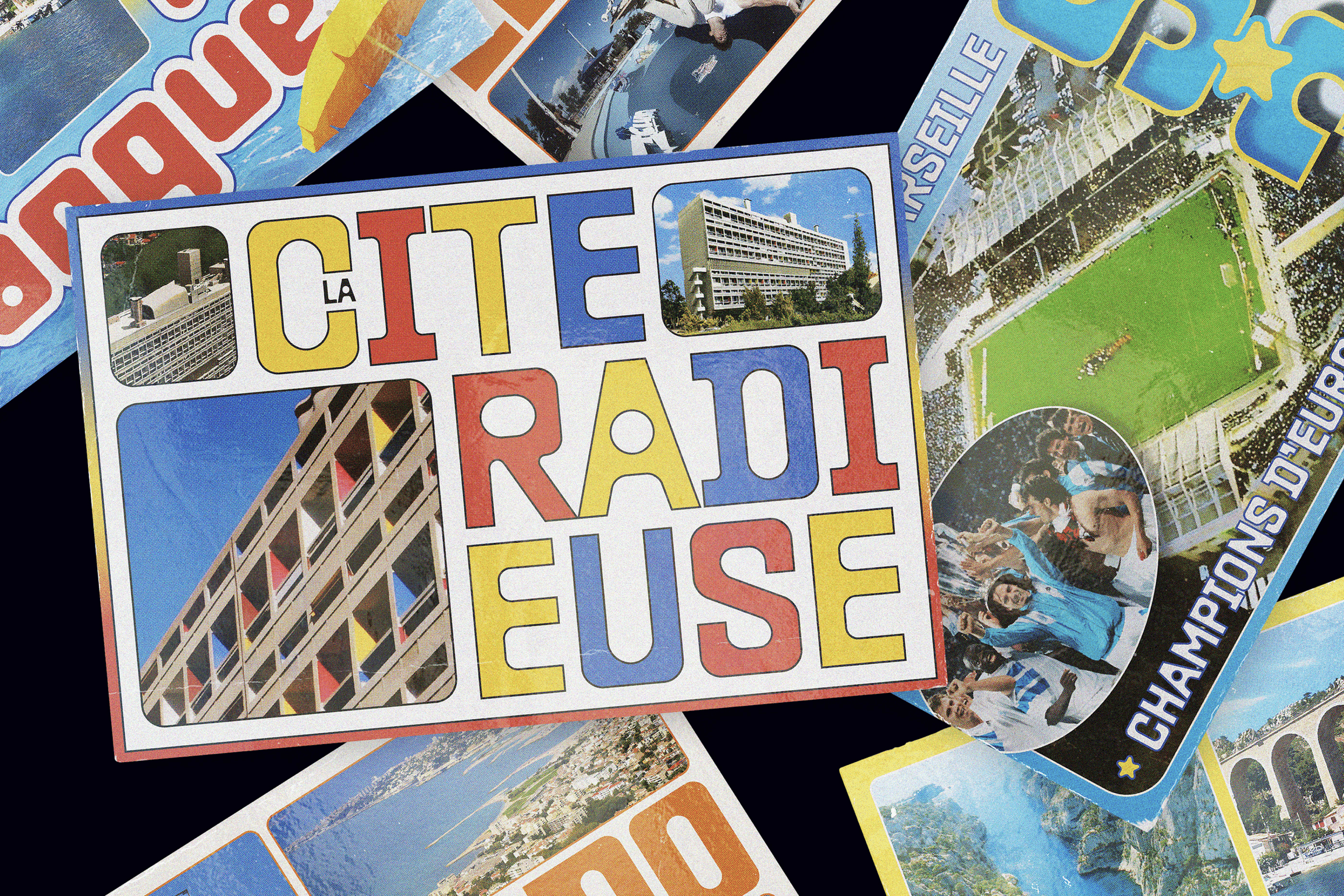
For the family release, we set up a postcard series based on the clichés and codes of tourist postcards. It was difficult to stay within these codes while maintaining a graphically interesting look that didn't detract from the font's presentation. It was a difficult exercise.
How did you overcome this challenge?
With lots of testing and documentation. And some cards were not kept in the final selection.
What and/or who inspired you during the creation of this project?
Lots of vernacular lettering, mainly painted, in the city streets.
What was your biggest learning or take-away from creating this project?
A simple graphic system can be used to create a striking, functional font.
Can you point out a detail in the project that might go unnoticed but you’re particularly proud of?
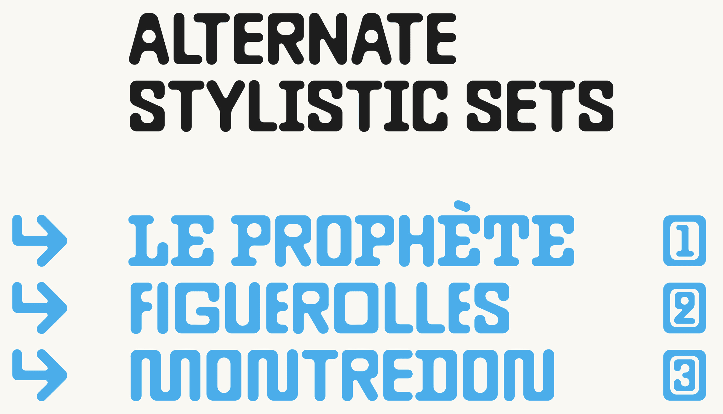
The stylistic variants bring a new aesthetic to the font, and we have not yet seen them used very often.
Which part of this project consumed the most time or energy?
The development of a typeface always takes a lot of time to apply the entire system to a complete set of characters, to set up spacing, kerning, all the tests...
What was the result of this project?
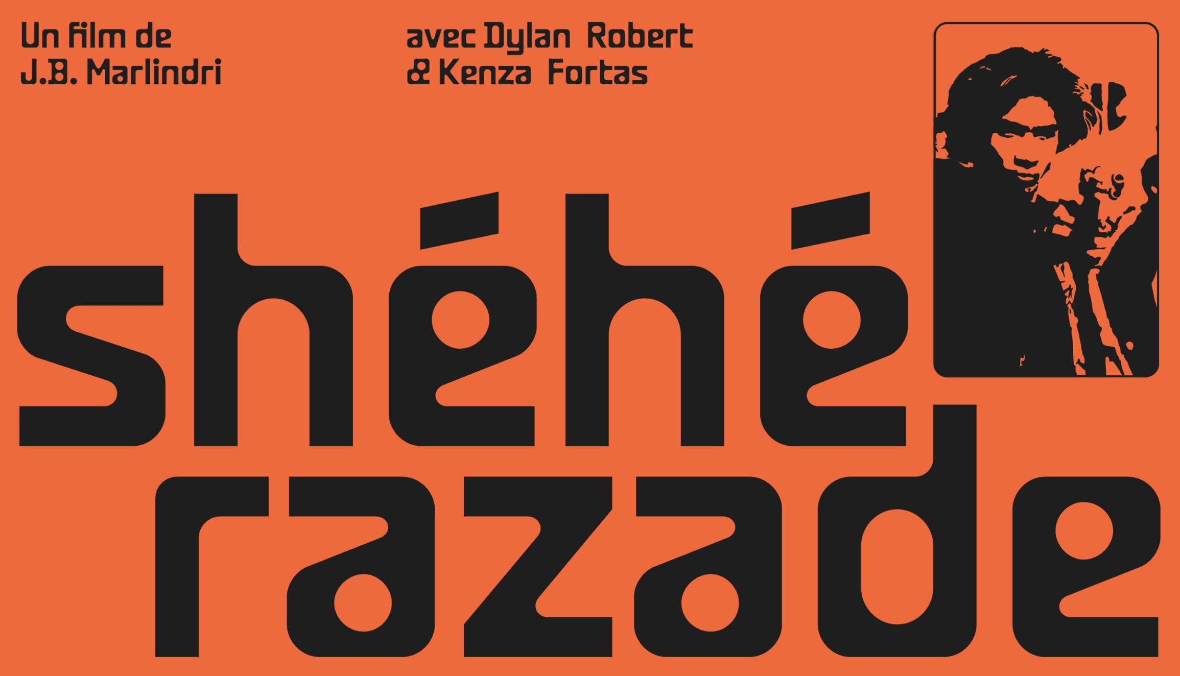
The font has been out for several months now, and a lot of great projects, mainly visual identity, have been implemented with it, which means it's pleasing and inspiring designers. It's always a pleasure to see other designers using and integrating our fonts into their projects.
Where was the project created? What do you enjoy about working there?
The project was created in-house at the Image Format studio.
If this project had a soundtrack, which one would it be?
Which tools did you use to create this project?
Glyphs for the design type.
What are you currently working on, and what's next?
We work on new fonts, self-initiated fonts and custom fonts.
Who or what are you inspired by lately? Any current influences that you find are seeping into your work
Lots of studios, graphic designers, but also the environment that surrounds us on a daily basis, from street tags to vernacular city graphics.
If you could give your younger self one piece of advice about navigating the design world, what would it be?
Persevere and work hard!
From the maker
https://www.behance.net/gallery/164759973/Baste-A-B-typefaces


