Maker
Client
Female Health company inne, based in Berlin
Category
#Brand Identity
#Visual Design
#Product Design
About the project
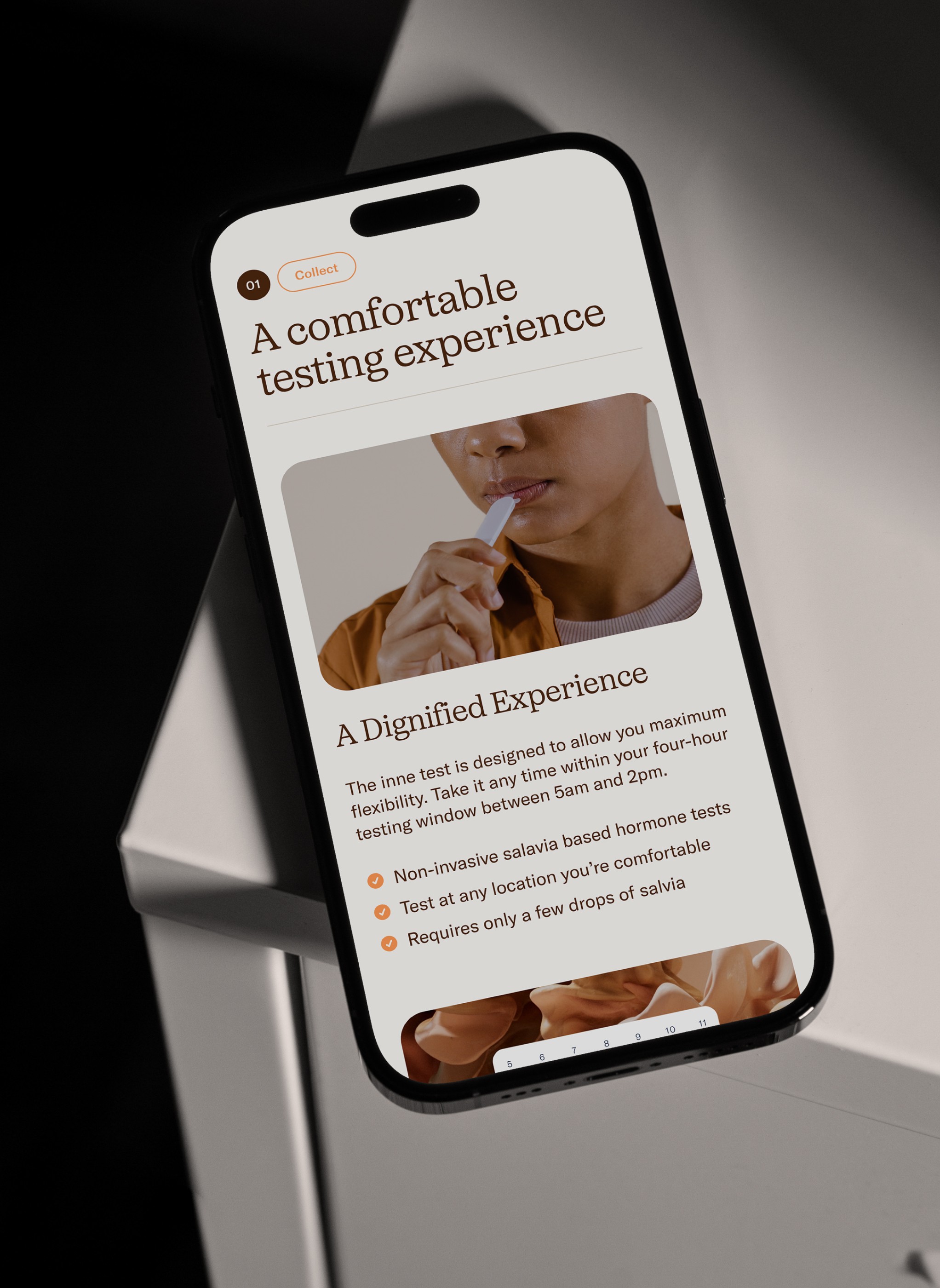
Inne has developed the world’s first at-home fertility monitoring system, designed to measure progesterone levels in saliva. Female health is under represented and under researched - by using the power of hormonal science, inne is leading a new era of enriched understanding. We helped inne evolve from being a product-led brand to one led by their purpose to guide woman across different life stages. To reflect this shift, we crafted a visual identity system based on the core idea “connect with your inner rhythm” that balances scientific accuracy, bold simplicity and human warmth. The resulting system is comprised of a strategic brand platform, an extensive 3D world, custom photography and documentation in the form of detailed brand manual.
What sparked this project?
Companies usually approach us to evolve their existing brand identities into cohesive systems. This mostly happens at a point of company growth or expansion into new markets / products. The challenge is to leverage some of the existing brand equity that was build but systemise and expand upon it to make it more flexible and give teams a set of tools to express the brand consistently. This was also the case for inne, who had already build a great foundation for their brand but had issues setting themselves apart from industry competitors and prepare the company for scale. Their approach to brand building was strongly led by their product but missed the articulation of a core idea that could express their true values and ambitions.
Who was on the team for the project?
Dokument:
János Spindler - Creative Direction & Brand Design
Todd Wilson - Creative Direction & Brand Design
Inne:
Franziska Mayer - Creative Director
Rosanna Motz - Brand Designer
Clemens Morris - Product Designer
Zaira Biagini - Visual Content Manager
Collaborators:
David Padilla - 3D & Animation
Tor Harrison - Photography
Do you have some project metrics to share?
All in all, between 2 designers, this was 800+ hours of work. From kickoff to handover; 10 months passed, 3 brand worlds developed, 3 extensive rounds of concept iteration, 30+ client meetings and then countless early morning walks spent trying to come up with idea that became our concept

What is your approach to working on a project like this? Do you follow a specific process or framework?
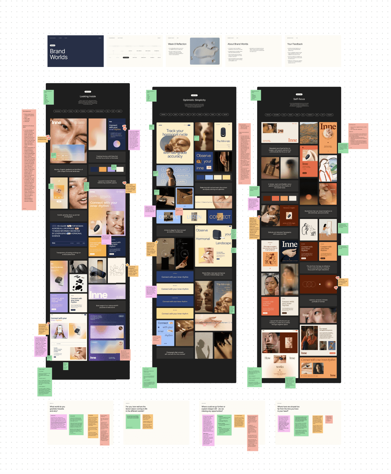
Our approach to branding is a journey through three distinctive phases: Discover, Define, and Create. Every project has its own nuances, requiring adaptability based on timelines and specific deliverables. During the Discover phase, our primary aim is to fully understand the client. This involves a series of interviews, surveys, a deep dive into their documents, and a close look at their brand legacy. Once we've collected enough information, we initiate an audit of the existing brand, examining it from strategic, creative, and messaging perspectives. This deep dive helps us to determine what elements are working and which might need reconsideration.
The culmination of this exploration is what we term the "Future brand brief." This document is multifaceted. It includes questions or challenges we believe the evolving brand should address, forming the bedrock of our strategic approach. Additionally, it offers a thorough competitor analysis and suggests early positioning opportunities for the brand.
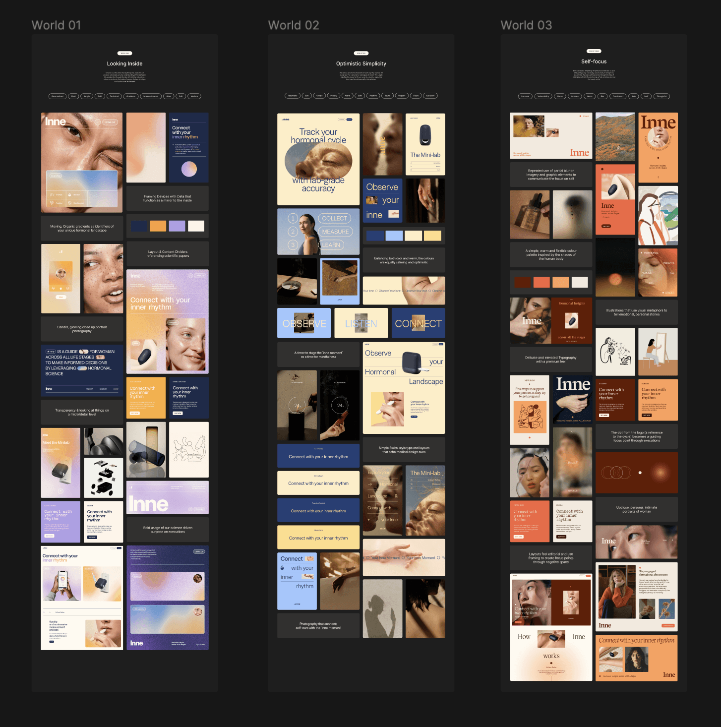
As we segue into the Define phase, strategy takes center stage. We start crafting a brand platform that encompasses the brand's values, position, purpose, and personality, illustrating how these elements come together to represent a singular vision and goal for the company. Parallel to this, we embark on a visual exploration through what we lovingly refer to as "brand worlds." These aren't rigid brand concepts; instead, they're a blend of initial explorations, mood boards, and potential ideas, granting us a glimpse into the possible universes a brand could inhabit. Once we identify the most fitting brand world, it serves as our foundation. From here, we construct a cohesive brand concept, guiding the client through the foundational idea, the identity's components, and its various applications, ensuring every element is in harmony with our brand strategy.
The journey doesn't end here. The Create phase marks the point where our ideas and strategies transition into tangible outcomes. After refining our direction, we bring onboard specialists - from photographers to illustrators - ensuring the brand identity truly comes alive. Concurrently, we tackle major brand touchpoints, with the website being a prime example. Here, emphasis is placed on structure, content, and design ethos. As we near completion, the brand finds its way onto a myriad of easy-to-use templates tailored for diverse platforms, from social media to presentations. Our final offering is a detailed brand guide, serving as both an inspirational and instructional resource, meticulously documenting every facet of the brand identity for future endeavors.


What did the early versions of this project look like? What did you learn from this v1?
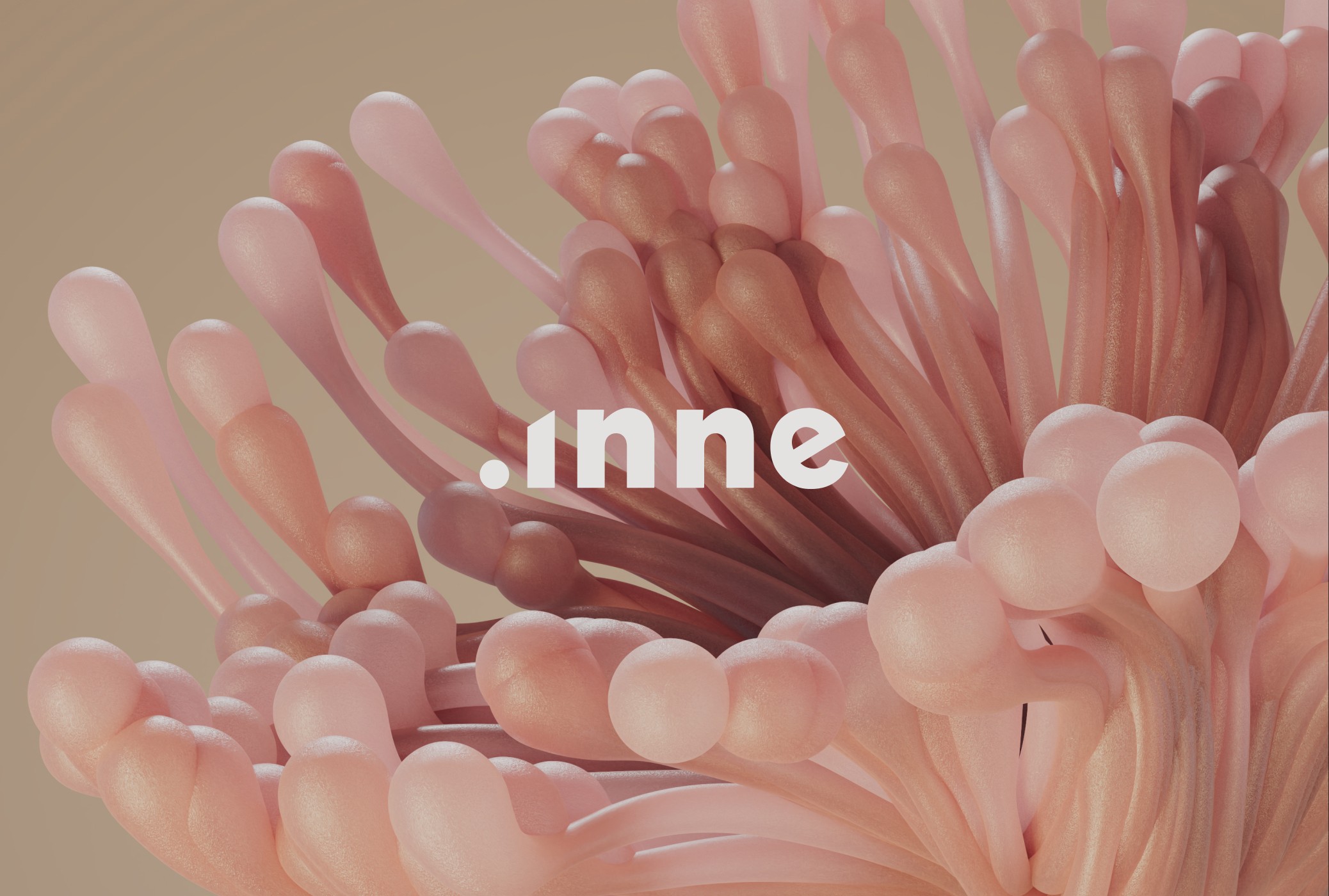
We’ve explored many different directions for this brand early on. One of the later ones that stood out was based around the shape of a circle as a symbol for the female cycle, the circular notion of time and feeling of rhythm. We felt we really nailed this, it was super simple but could come to life in interesting ways through the layout and different circle treatments. After some reflection, inne's founder voiced the feeling that this concept, while beautiful had one flaw: the circle represents perfection and inne is not about that, it’s about the imperfections and unique connections woman often have with their fertility. The circle represented a kind of “sameness” that felt wrong. This feedback directly sparked the idea behind our final concept of “connect with your inner rhythm” which uses imperfect textures and repetition as a leading motive that is expressed through 3D landscapes.
'By using the power of hormonal science, inne is leading a new era of enriched understanding.'
What was the biggest challenge? Did any part of the project make you step out of your comfort zone?
Female health and fertility are very sensitive topics that women have different, often difficult experiences with. We felt a great level of respect and responsibility when approaching this subject matter. We wanted to create a brand that feels approachable, supportive and warm but also scientific, innovative and a little bit abstract, allowing a wide range of woman to identify themselves with the brand on a deeper level. Getting this feeling right was very important to us.
How did you overcome this challenge?
We knew from the beginning that we needed to be honest with ourselves and the inne team: we’re two men who’ll never experience or fully understand many things that come with being a woman - physically, mentally or otherwise. For this reason, we were in constant dialogue with inne’s primarily female team, discussing the subtle nuances in perspective and importance of details that were not familiar to us. This was an immensely interesting and helpful experience that often pointed us in the right direction and gave us needed confidence in the work.
What and/or who inspired you during the creation of this project?
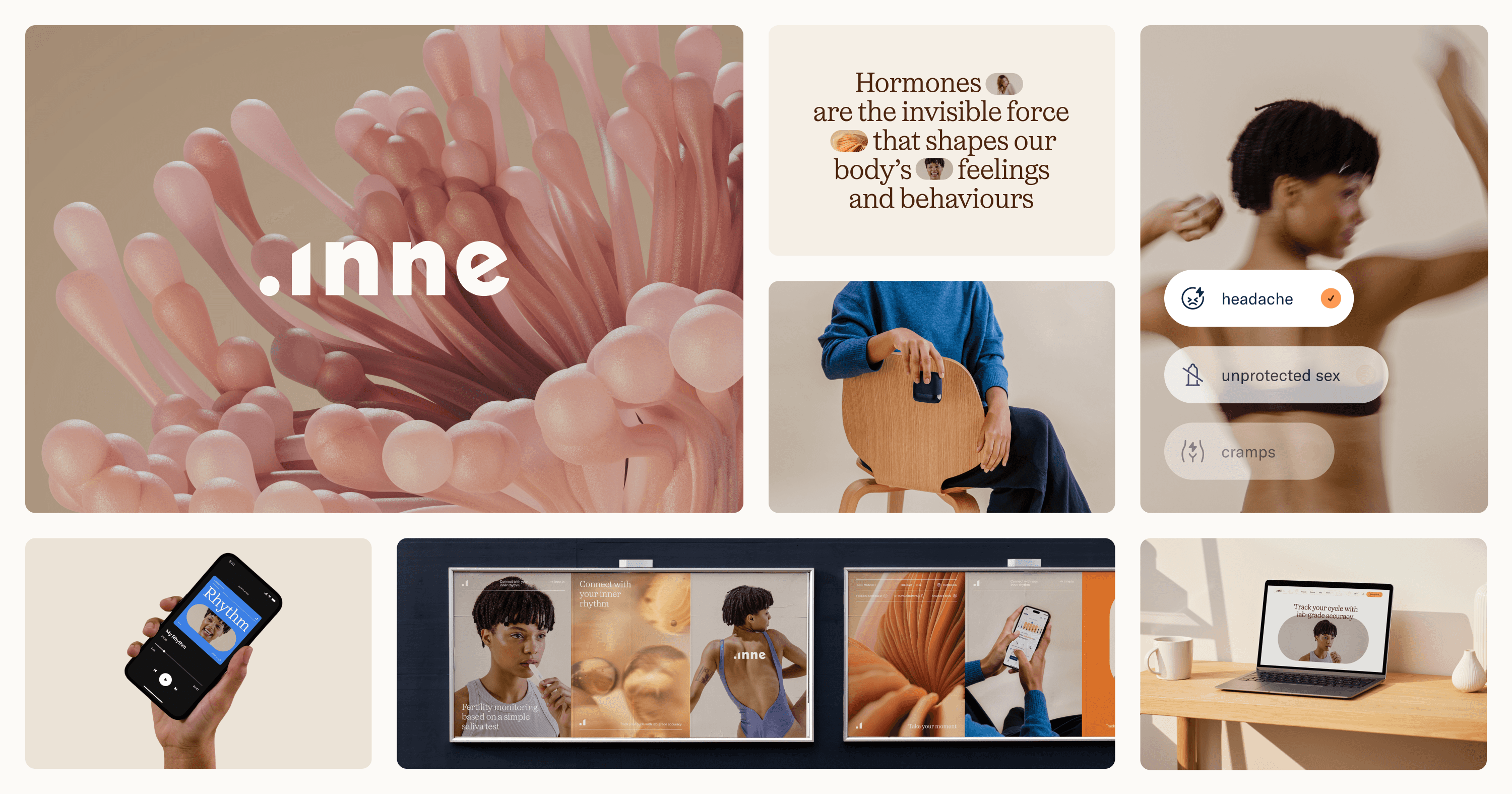
We pulled from a wide range of references and inspirations such as scientific papers, or packaging that inspired the line system which runs through the identity. We looked at a lot of photos, mostly shot by woman portraying other woman that feel intimate and honest to find the right tone for our brand photography. Charlotte Lapalus’s work was a huge inspiration.** For the 3D portion of the work, we took direct reference from nature. Biology and macro photography of plants, shrooms, human skin, organs and more helped us develop a inner world of repetition, pattern, and textures - all with their organic imperfections. We also pulled direct inspiration from their well-designed product - their minilab, with it’s soft rounded corners and turned it into a shape called “the capsule” which is used in various ways throughout the identity.
What was your biggest learning or take-away from creating this project?
In times of design subscription services and one week brand sprints, it’s easy to doubt yourself during a 10 month project but it’s important to remind ourselves that good branding takes time. Timelines are often something clients push back on - not so in the case of inne. Their team fully understood that you can’t create work of this scope in a rushed manner because it’s an investment in the future - we’re grateful for that. Time and space for exploration, discussion and refinement are an important part of the process, they allow brands to become more memorable, smarter and connect deeper with their audience.
Can you point out a detail in the project that might go unnoticed but you’re particularly proud of?
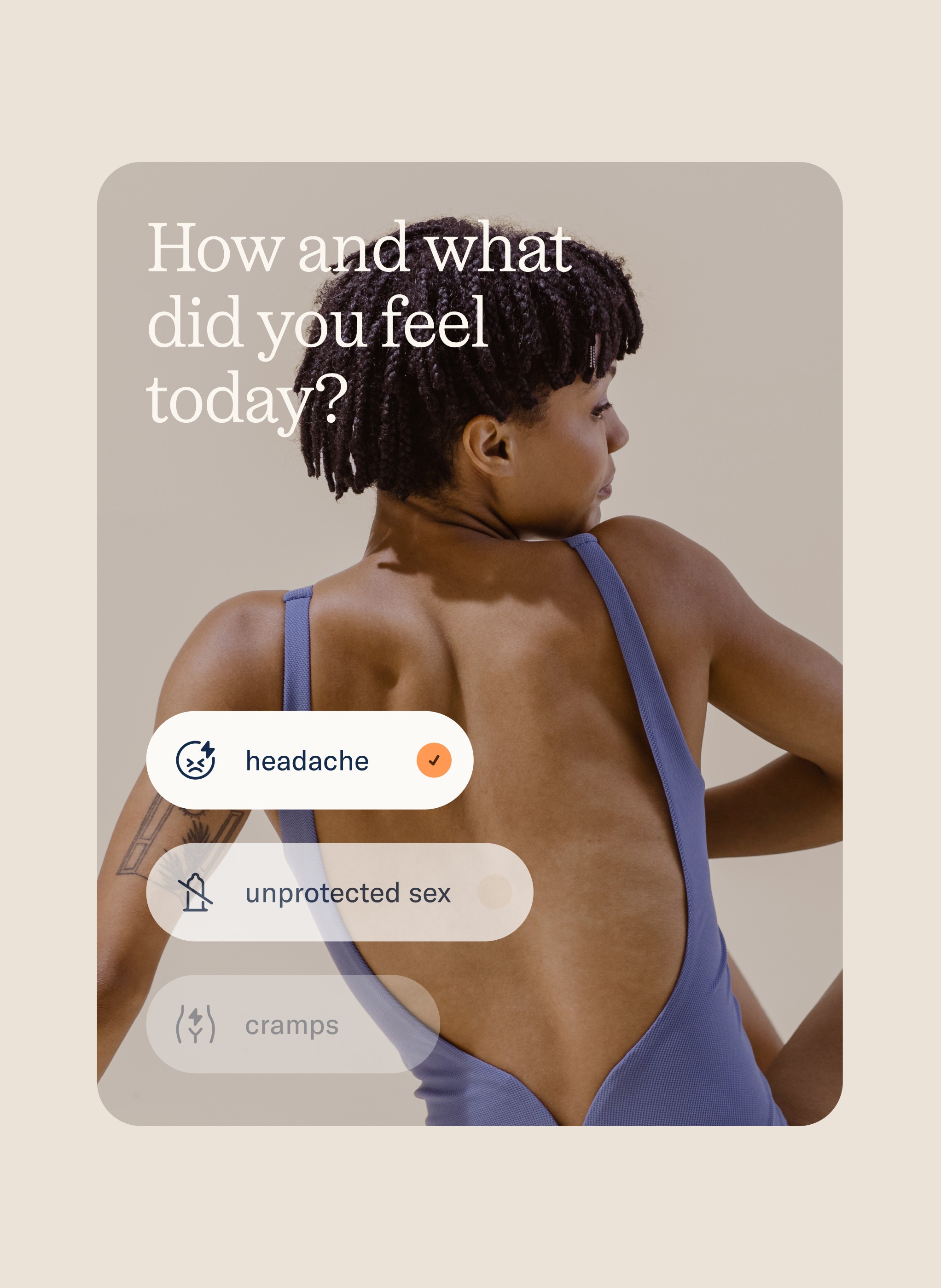
We’re proud of how all the identity elements come together to form a simple, cohesive language that is still highly flexible and enables the client to get creative, pushing the brand to it’s limits while also creating executions that maintain consistency. One detail we’re particularly proud of is the photography system called “Moments” which is used to classify types of brand photography: life moments, product moments, connection moments & small moments - each providing a unique solution for requirements the team had e.g “scalability” allowing content to be produced fast without relying on stock photography or overused visual metaphors.
'We wanted to create a brand that feels approachable, supportive and warm but also scientific, innovative and a little bit abstract, allowing a wide range of women to identify themselves with the brand on a deeper level.'
Which part of this project consumed the most time or energy?
The most exciting part for us was working with David Padilla on the 3D Landscapes - which we’ve art directed in close collaboration with him and the team at inne. While not the most time consuming part of the project, they did require extra attention and energy because it was so important to get these expressions to feel right. We went through many rounds of explorations and iterations and we’re eternally grateful how patient David has been with us through this process and his eagerness to perfect these.
What was the result of this project?
One part of project, that hasn’t launched yet is inne’s new website. We’ve re-designed their entire web experience from a content, story & design perspective. Until the site is live, measuring the quantitive impact is hard. We’re excited that the project has been featured on some of our favourite design platforms and so-far has received positive reception online by users and internally by employees.
Where was the project created? What do you enjoy about working there?
Our studio is fully remote and we both work from our homes in Berlin. A few things that make a good home office in our opinion is being surrounded by things you enjoy such as posters, books, objects. A good chair, nice light and noise canceling headphones are also important for posture & mood.
If this project had a soundtrack, which one would it be?
Which tools did you use to create this project?
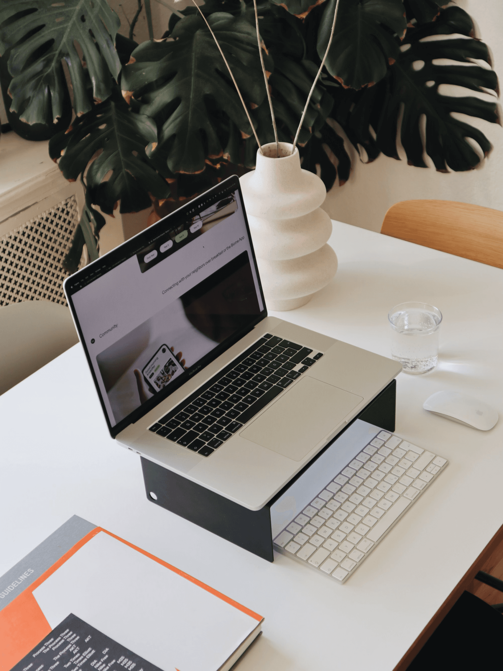
95% of our design work happens Figma these days. Being able to collaborate easily with our clients is very important to us and by using the tools which are already established in an organisations, we keep things simple. During the kickoff and strategy phases of a project we frequently use Figjam to run remote workshops. When it comes to documenting and handing over the brand we lean on Figma to create design components, templates and an open brand manual that is easy to update.
What are you currently working on, and what's next?
We’re putting the finishing touches on the development of a website we’ve designed. It’s for a housing product that offers planet-conscious and flexible homes that adapt to people’s needs and lifestyles. Having created their brand identity at the end of 2021, we’ve been closely collaborating with them for the past two years. With this website we’ve tried to really push ourselves and use animated, interactive elements as a main storytelling tool.
Who or what are you inspired by lately? Any current influences that you find are seeping into your work
Rather than specific micro trends in design or branding, we find inspiration by getting away from the screen and out into the city or nature. Walking & exploring different environments provides us with the rare ability to think clearly in an otherwise fast, confusing and often exhausting world. As designers of brands, a personal interest in hiking and the outdoors has influenced our aspiration to design a very functional yet human brand for a sustainable outdoor or active-wear related company. If you are building something like this - lets talk.
If you could give your younger self one piece of advice about navigating the design world, what would it be?
Learn and practice to present your work, both from the perspective of how you visually unfold and then verbally tell a story. Both of us struggled with this for a long time. Being able to speak with confidence and expertise to what you create is a valuable skill we often see missing in younger designers we work with.
From the maker