About the project
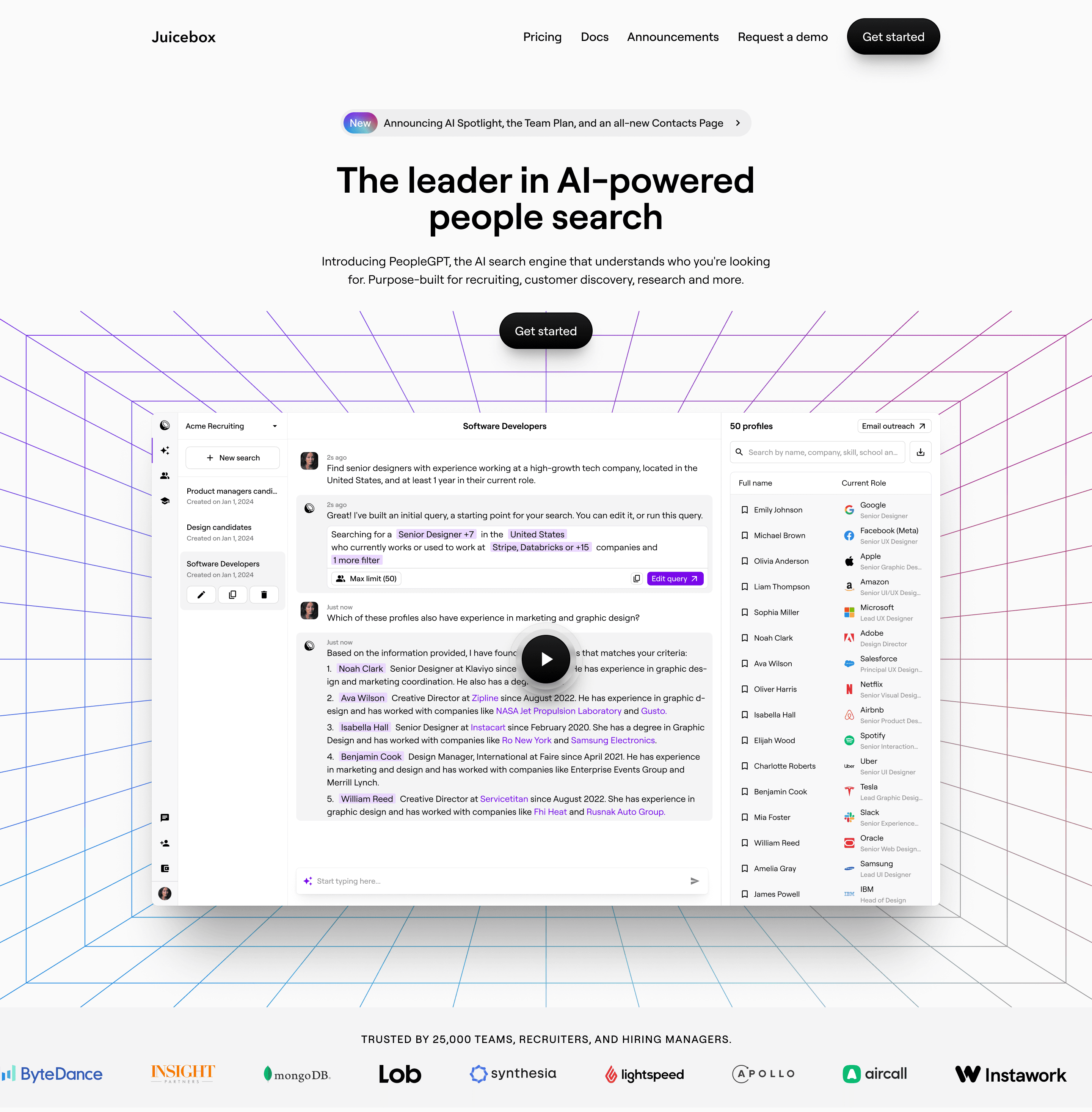
Juicebox reached out to us to redesign their existing website. The YC-backed company had already an influx of customers but they knew that to move the next stage of their growth they needed something presentable that could speak to their target audience.
What sparked this project?
The driving force behind this project was Juicebox's aspiration for the next level of growth. As mentioned earlier, they reached out to us because they realized that their existing website wasn't fully resonating with their target audience, and they needed a more compelling online presence to achieve that next step.
Who was on the team for the project?
Benoit Chabert, Lead Designer, Pixel-1
Maksim Slobodchikov, Designer, Pixel-1
Sami Nabid, Junior Designer, Pixel-1
Do you have some project metrics to share?
We had a very short turnaround for the project. 3 weeks including everything. It was demanding as I was also going on vacation during one of those 3 weeks. In the end, there was a few explorations and animations we had to gut to make it to the finish line but we're all happy with the result
What is your approach to working on a project like this? Do you follow a specific process or framework?
We begin every project by diving deep into the client's business landscape: understanding their current position, how they arrived there, and where they aim to go. This informs us about the current and intended audience for their website.
On a parallel track, we conduct user research to understand how people perceive the website and their user goals. We want to make sure we're creating something that aligns both the business goals and the users goals. With this project very tight timeline we relied on our conversations with stakeholders and their conversations with customers.
Ultimately, our aim—whether through interviews, surveys, or conversations—is to foster a nuanced understanding of both the user and the business. The more thoroughly we comprehend these elements, the more effective our design will be. For time-sensitive projects like this one, we proceed based on the insights gathered from these dialogues.
What did the early versions of this project look like? What did you learn from this v1?
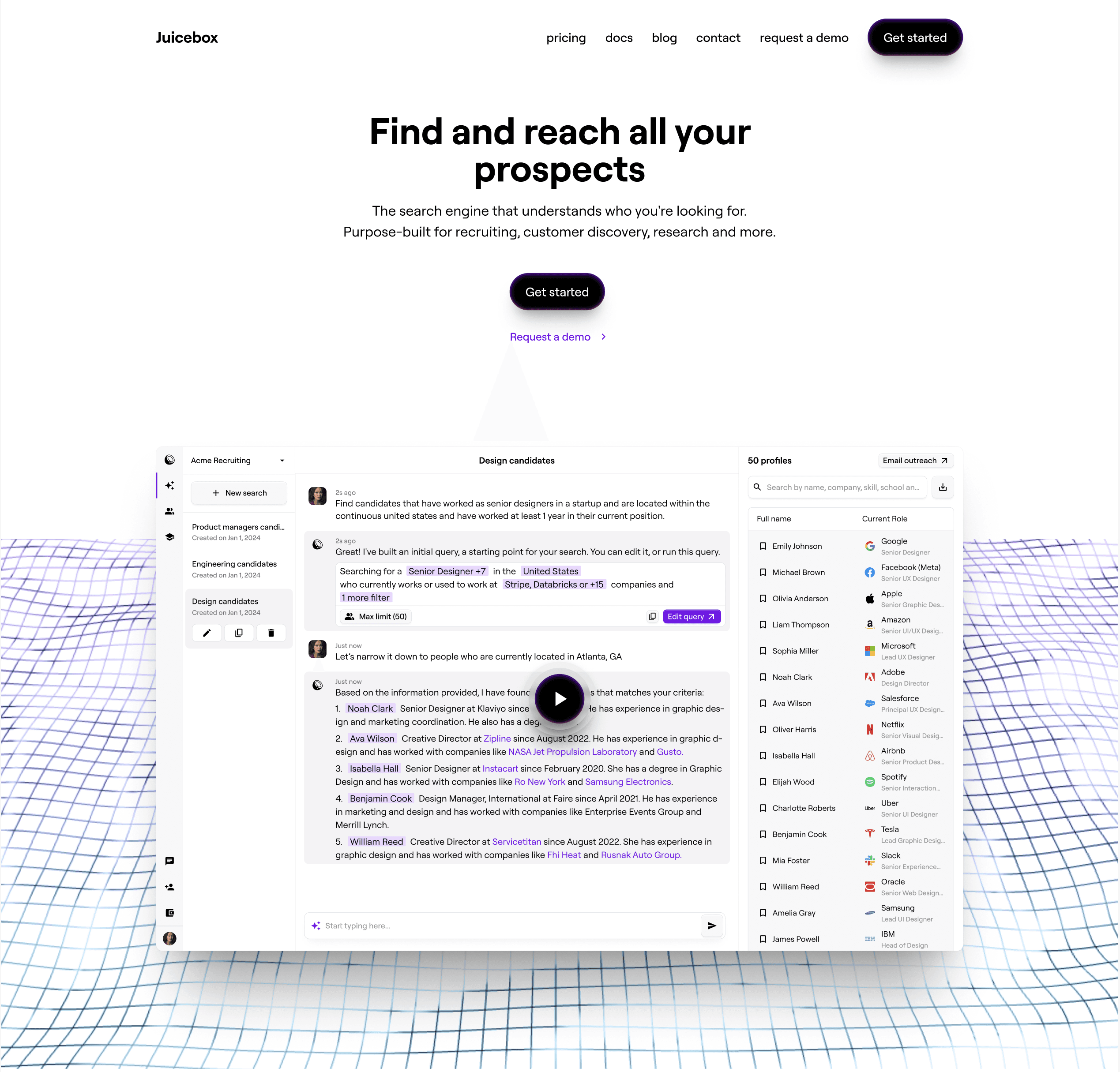
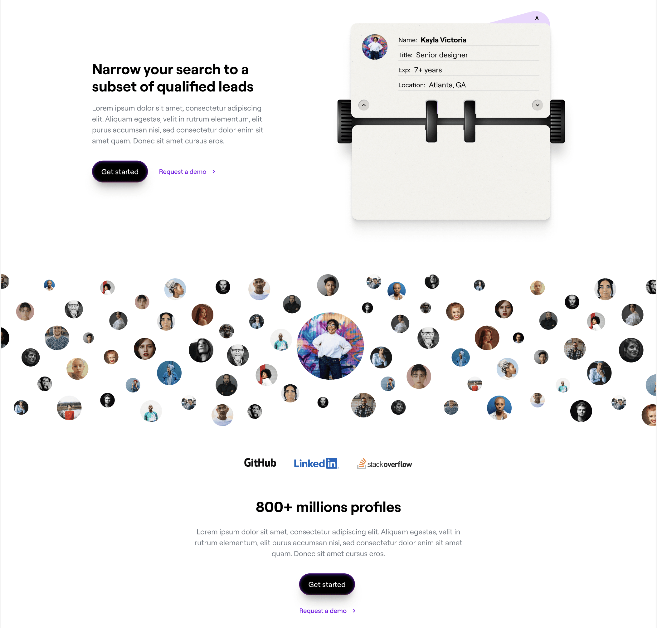
We like to explore, we were going towards this retro-futuristic vibe that the client and our team really liked. The idea was to combine the old with the new. It felt like it was aligned with how they wanted to present the brand.
'We begin every project by diving deep into the client's business landscape: understanding their current position, how they arrived there, and where they aim to go.'
What was the biggest challenge? Did any part of the project make you step out of your comfort zone?
We had never used that kind of styling before, so the initial phases were filled with trial and error as we sought to capture the unique retro-futuristic essence we envisioned.
How did you overcome this challenge?
We continued to explore with confidence. While the creative process often entails moments of uncertainty, we knew that everything would coalesce eventually.
What and/or who inspired you during the creation of this project?
We usually look a lot at old school stuff. Old posters and retro looking magazines or layouts. For this specific project, the challenge and excitement lay in harmonizing these timeless elements with contemporary design features.
What was your biggest learning or take-away from creating this project?
For us the biggest take away was to continue to trust our instincts. Our early explorations fell short of the final outcome, largely because we hadn't fully embraced the chosen direction. Once we solidified our artistic vision, we were able to seamlessly integrate the various elements, resulting in a more cohesive and impactful design.
Can you point out a detail in the project that might go unnoticed but you’re particularly proud of?
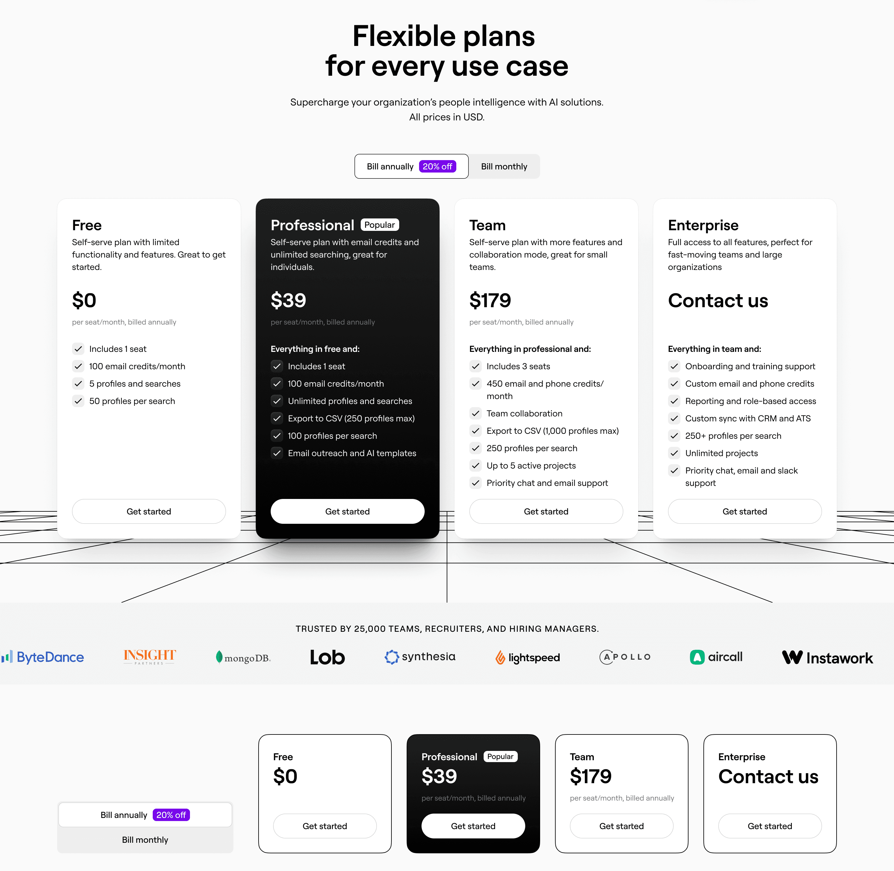
We're pretty happy with how the mobile pricing table turned out. It's very packed in information and most designs we've seen out there simply hide all of it to a point where you may need to do a lot of taps to reveal the information. Our design makes the information accessible and readable even on a mobile phone.
'For us the biggest take away was to continue to trust our instincts.'
Which part of this project consumed the most time or energy?
The home page was undoubtedly the most time-consuming aspect of the project. Our initial designs featured animations with a blurred background, which unfortunately caused minor yet noticeable glitches on older machines. We spent a large amount of time figuring out how to address this.
What was the result of this project?
We're continuing to closely monitor traffic to gather more key metrics. In the meantime, our work caught the attention of another YC-backed company, which has led to a new opportunity for a website redesign. We're absolutely thrilled to embark on this upcoming project.
Where was the project created? What do you enjoy about working there?
We use a lot of Pinterest, Figma and Framer. We usually do the early phases in Pinterest/Figma and then once the designs are complete we move to Framer.
If this project had a soundtrack, which one would it be?
Which tools did you use to create this project?
Framer, Figma, Pinterest, M1 Apple Studio with Apple Display
What are you currently working on, and what's next?
We're working on quite a few Framer projects at the moment that are all websites redesign. We have a portion of the company that specializes on Product design and so this side is providing support to existing companies (especially around Growth → activation, engagement, retention, etc). We also have a very special template in the work that'll be coming up soon.
Who or what are you inspired by lately? Any current influences that you find are seeping into your work
Current influences are deeply rooted in retro aesthetics, magazine layouts, and the world of fashion. There's a wealth of creative ideas from the past that still feel revolutionary today. I find immense inspiration and a sense of timeless ingenuity in exploring these elements.
If you could give your younger self one piece of advice about navigating the design world, what would it be?
I come from an Art background and what I always loved about art is that in someway it's less judgmental than design. You can just do what you personally like and people will gravitate to it or not and other artists don't necessarily feel like they need to have a strong opinion about it. I think it's easy to get caught up in what everyone else is doing. The truth is if you figure out what you like to do and double down on that then this honesty and authenticity translates in your work.
From the maker


