About the project
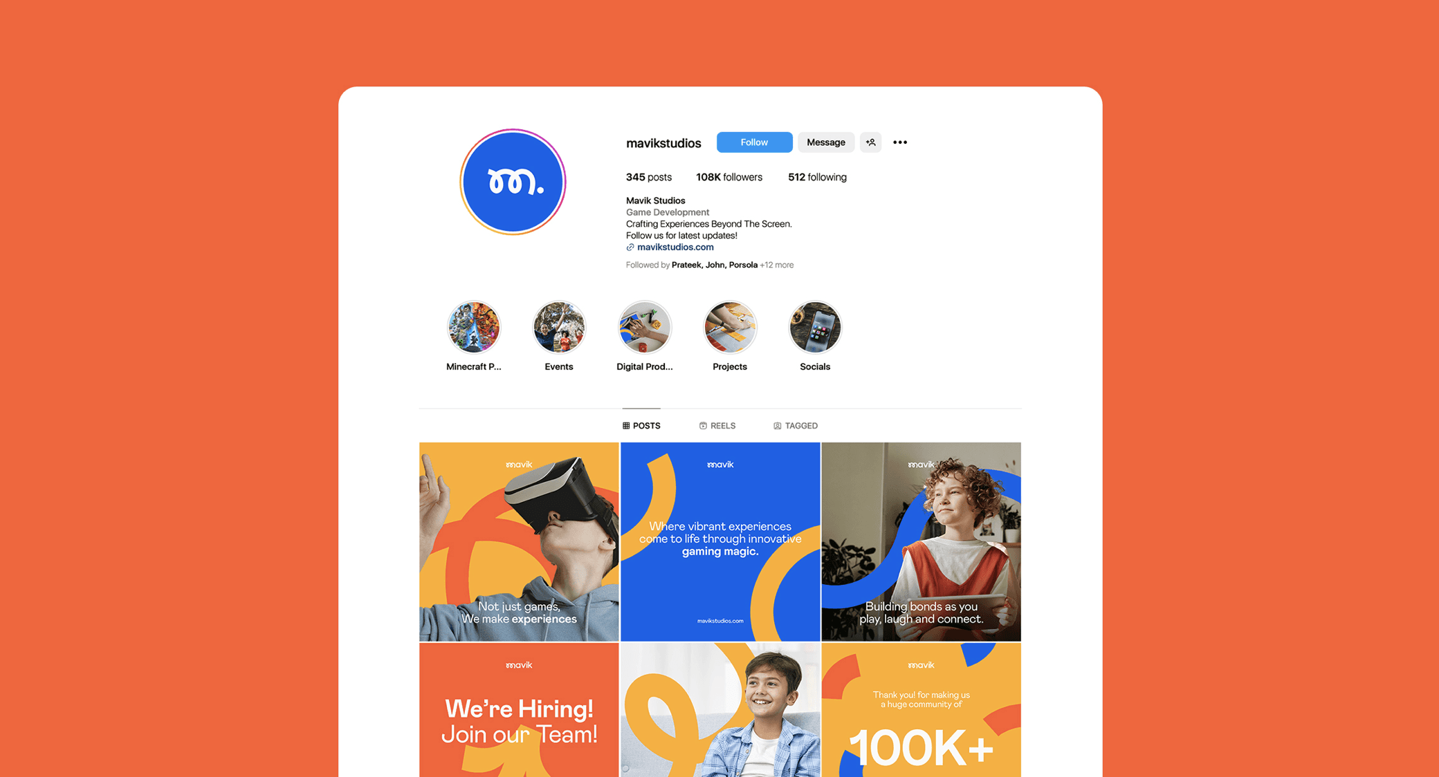
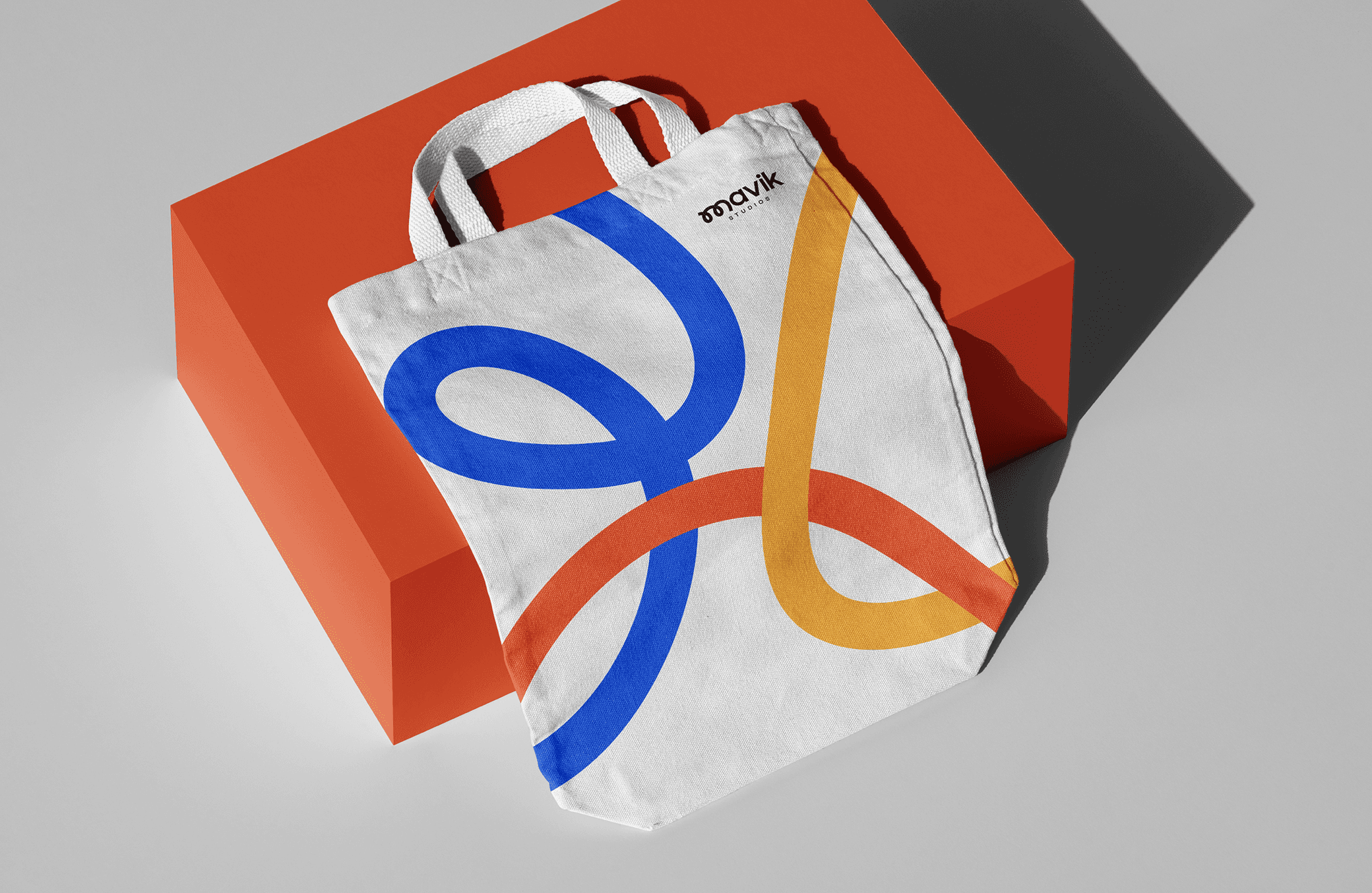
MAVIK Studios functions as a corporate entity that holds ownership stakes in several game development companies. The visual identity project for Mavik Studios© is all about encapsulating the essence of the brand's Mission, Vision, and core values within a timeless and cohesive identity and design framework. This involves crafting fundamental components like crafting a comprehensive visual identity system & art direction of the brand. The ultimate aim is to infuse the design with a sense of playfulness, vibrancy, and youthful exuberance that harmonizes seamlessly with the overarching vision of the company.
What sparked this project?
The project ignited from the brand's vivid description, instantly conjuring images of "vibrant," "bouncy," and "playful" in my mind. These foundational ideas were the bedrock for the entire initiative. I'm proud to have transformed these concepts into a finely crafted, lasting identity system. This undertaking distinguishes itself from my typical assignments, showcasing the evolution of a potent idea into a tangible and enduring creative masterpiece.
Who was on the team for the project?
No, this project was not a team project. I handled everything, from the visual identity development to the motion design, entirely on my own.
Do you have some project metrics to share?
Over the course of three weeks, my client and I embarked on a project with a distinct vision in mind, reducing the need for extensive iterations and allowing us to play around the initial idea effectively. Amidst the creative process, we fuelled our inspiration with approximately 4-5 cups of coffee, although the exact count escapes me. This project was a two-person journey, featuring myself and the client, who actively engaged in two rounds of revisions, resulting in this visual identity system that mirrors the original vision.

What is your approach to working on a project like this? Do you follow a specific process or framework?
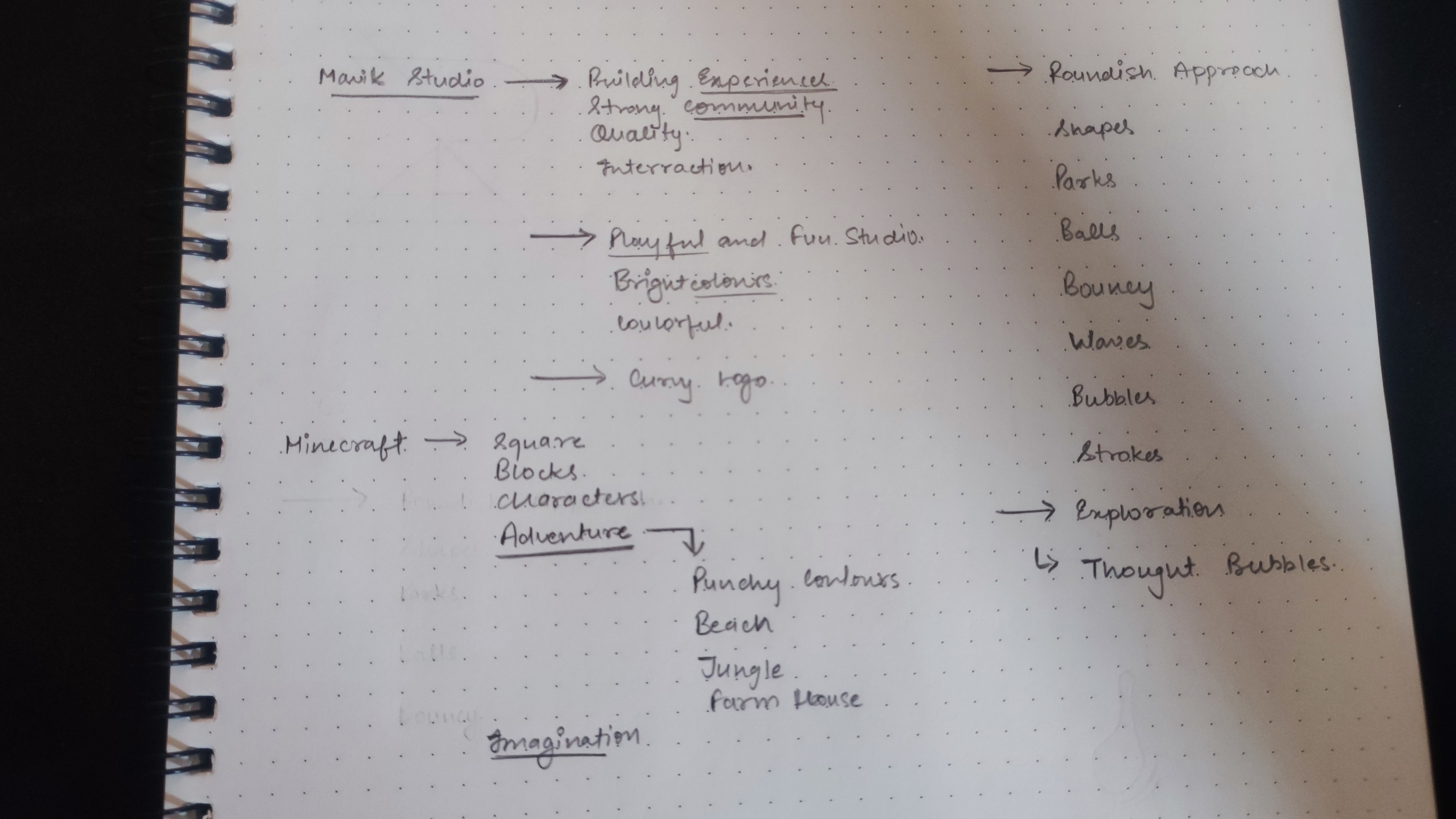
My approach to projects like this is rooted in a personal connection to the brand and its intended audience. To begin, I step out of my designer mindset and put myself in the shoes of various stakeholders: a newcomer, a prospective customer, an employee, and finally, a designer. This multi-dimensional perspective provides me with a comprehensive understanding of the brand's essence. From there, I embark on a visualization journey, breathing life into the identity. One fundamental aspect that consistently holds my identity design projects is scalability. I envision the brand's identity on a spectrum, from the smallest scale, such as the brand's icon or colours, to the grandest scale imaginable—industry-level implementations across diverse digital and physical platforms. This approach enables me to assess whether the most minute brand element can seamlessly expand into a robust identity system, ensuring that the brand resonates with audiences across various demographics.


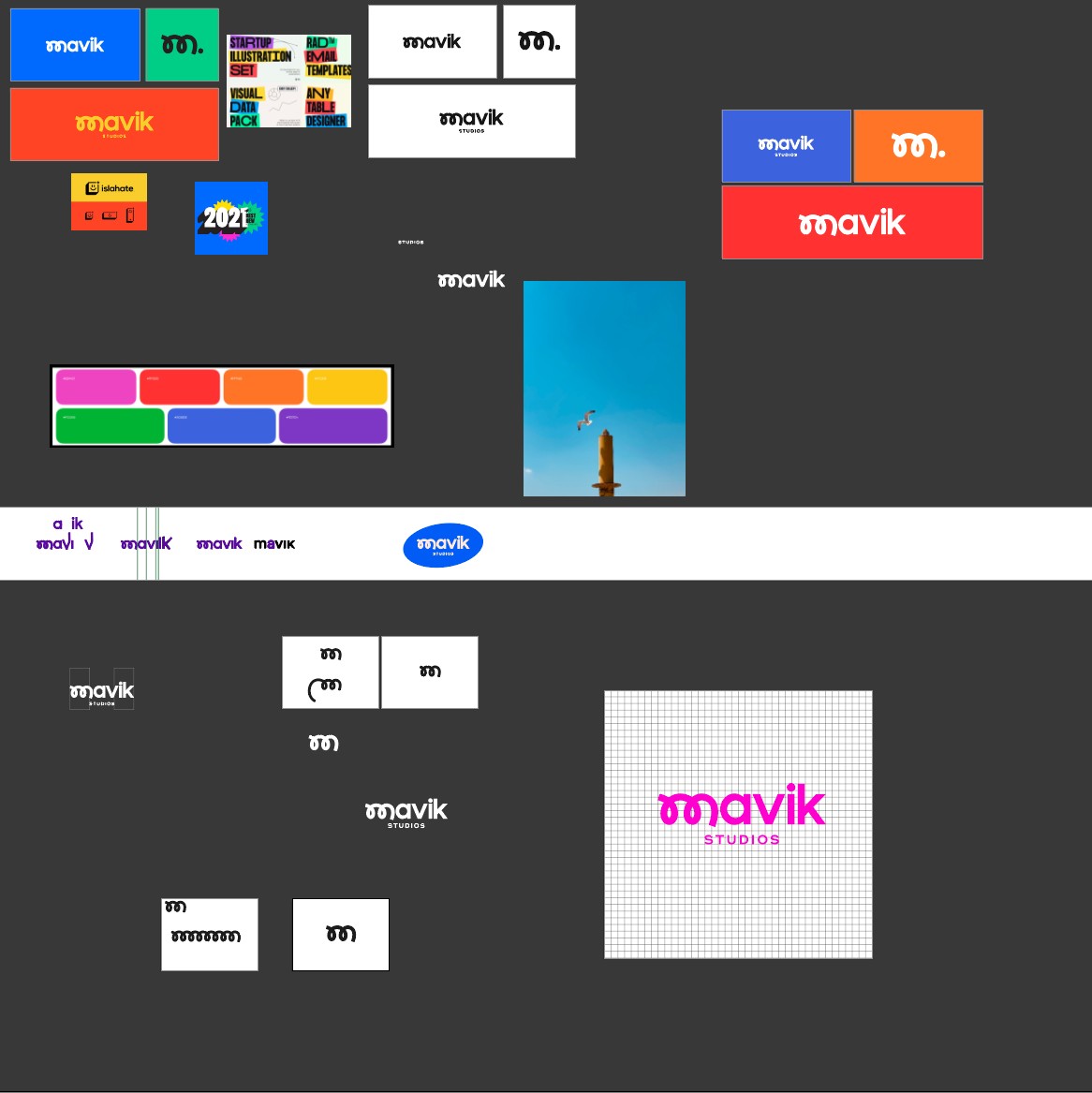
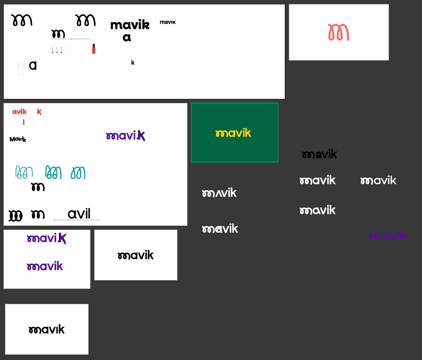
What did the early versions of this project look like? What did you learn from this v1?
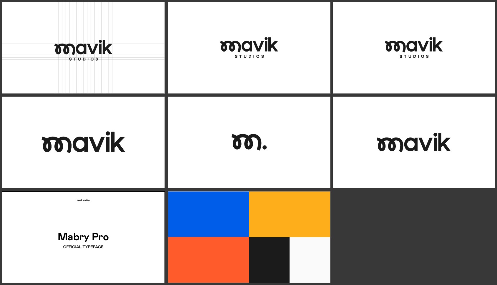
The initial iterations of the project had a certain rawness to them, as the elements of the identity, such as shapes and colours, were not yet harmoniously synchronized. In particular, the wordmark demanded significant attention. It gave me a learning experience in terms of kerning and the introduction of foreign elements into a traditional lettering design. Selecting the brand's colours was an enjoyable process, as it involved discovering vibrant, cheerful, and lively hues that truly encapsulated the brand's essence.
'These initial thoughts laid the foundation for the entire project, and as a designer, I was able to transform these initial concepts into a well-crafted, enduring identity system.'
What was the biggest challenge? Did any part of the project make you step out of your comfort zone?
The most significant challenge I encountered during this project was the need to cater to an audience aged 13 to 17, which was a step back from my usual projects. This required me to rethink the brand from a unique perspective while keeping in mind its affiliation with software development companies. Additionally, type design isn't my forte, so crafting the wordmark was another demanding aspect of the project. It demanded my close attention and precision to ensure it evolved into a visually appealing cornerstone of the brand's identity. These challenges pushed me out of my comfort zone and prompted me to explore new creative horizons.
How did you overcome this challenge?
I overcame these challenges by dedicating my time and attention to the project, rethinking my design decisions, and giving the project the creative effort it demanded from me as a designer.
What and/or who inspired you during the creation of this project?
For this project, I didn't draw inspiration from specific designers, but rather, I found my creative direction and inspiration from online platforms like Behance, Pinterest, and Dribbble. These platforms served as valuable resources, helping me chart a clear creative pathway for myself.
What was your biggest learning or take-away from creating this project?
Embrace exploration without fear of failure. Even those you look up to have ventured into the unknown and faced setbacks – it's these experiences that shaped them into who they are today. They learned, grew, and improved and so will you. So, keep exploring!
Can you point out a detail in the project that might go unnoticed but you’re particularly proud of?
Absolutely Yes!! one detail in the project that I'm particularly proud of and believe might go unnoticed is the motion design aspect. It holds a special place in my heart because I initially entered the design field with the intention of learning motion graphics. However, due to technical constraints, I couldn't pursue it at the time. Years later, after acquiring the right equipment, I still struggled with procrastination. Over the past 5-6 months, I finally dedicated myself to learning motion design, and this project provided the perfect canvas to showcase my newfound skills. So, while it may not immediately catch the eye, the motion graphics, especially the logo animation, are elements that I hold in high regard and take immense pride in.
'Embrace exploration without fear of failure. Even those you look up to have ventured into the unknown and faced setbacks – it's these experiences that shaped them into who they are today.'
Which part of this project consumed the most time or energy?
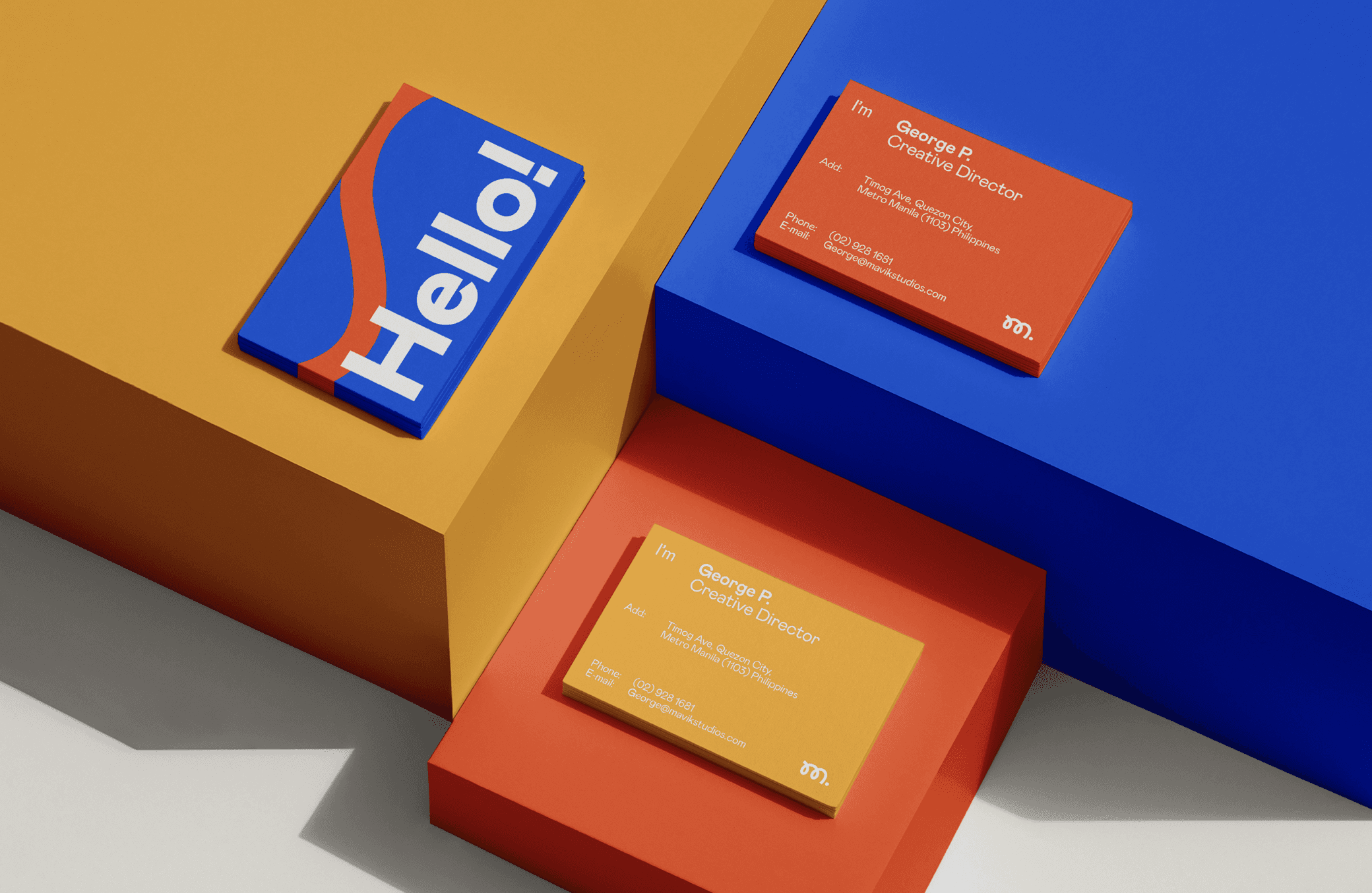
Design of the logo and its elements. Since the shapes were organic, round, and bouncy they were quite challenging to nail. Each iteration required meticulous attention to detail to ensure the design flowed seamlessly and avoided appearing mechanical.
What was the result of this project?
The result of this project has been quite remarkable. It quickly became my most successful visual identity project in terms of engagement across my social media platforms. On Twitter, it garnered the highest number of likes, while on Behance, it became my most viewed and appreciated project. Although the project hasn't directly led to any new projects at this point, I am genuinely pleased with its rapid growth and positive reception in terms of metrics and engagement.
Where was the project created? What do you enjoy about working there?
There's nothing to crazy about my setup, as it's a fairly new setup. I prioritize a serene environment with ample natural lighting, which not only prevents distractions but also enhances my focus. The simplicity of the setup allows me to immerse myself fully in my design process, fostering a productive and creative atmosphere.
If this project had a soundtrack, which one would it be?
Which tools did you use to create this project?
To realize this project, I used a suite of software tools and essential hardware:
Adobe Illustrator: Used for crafting foundational brand elements, including the logo design, color palette, and other brand assets.
Adobe Photoshop: Instrumental in enhancing the brand's identity, integrating various elements to produce graphics suitable for both digital and physical platforms.
Adobe After Effects: Leveraged for its prowess in motion design, adding vibrancy and dynamic animations that elevated the visual appeal of the project.
Adobe InDesign: Essential for designing physical media, print materials, and the detailed brand style guide.
Hardware: My computer setup and peripherals, though not highlighted, were crucial in streamlining and efficiently completing the project.
What are you currently working on, and what's next?
Currently, I'm deeply engaged in multiple identity projects for various brands, some of them being in the streetwear and mattress sectors. My immediate focus is on enhancing my skills in motion design, as it's an area I'm passionate about. Looking ahead, I have long-term aspirations to expand my creative horizons beyond the digital realm, potentially exploring fields like movie direction or scriptwriting. To kickstart this journey, I'm planning to introduce content creation that documents my design journey, offering a platform to explore different creative directions and collaborate with a wider array of brands.
Who or what are you inspired by lately? Any current influences that you find are seeping into your work
Lately, I've been finding inspiration from various design studios and individual designers. Some of them are like Seven (@seven_playstudy), Ordinary Folk (@ordinaryfolkco), and Buff Motion (@buffmotion) have been particularly influential, and their work has been seeping into my creative process. I also want to give a shoutout to my design buddies at The Grid. These talented individuals have been by my side since the inception of my career, serving as a continuous source of motivation and encouragement as I navigate the branding realm and push the boundaries of my creative capabilities.
If you could give your younger self one piece of advice about navigating the design world, what would it be?
Don't put too much pressure on yourself. Trust your instincts and don't be afraid to follow your creative intuitions. While striving for excellence is important, don't discard your ideas or demotivate yourself simply because you can't achieve perfection. Remember that imperfection is what makes us unique as person and as designers. Additionally, always remain open to criticism, as it is a valuable tool for personal and professional growth.
From the maker