Maker
Category
#UX Design
#User Centered Design
#Product Design

About the project
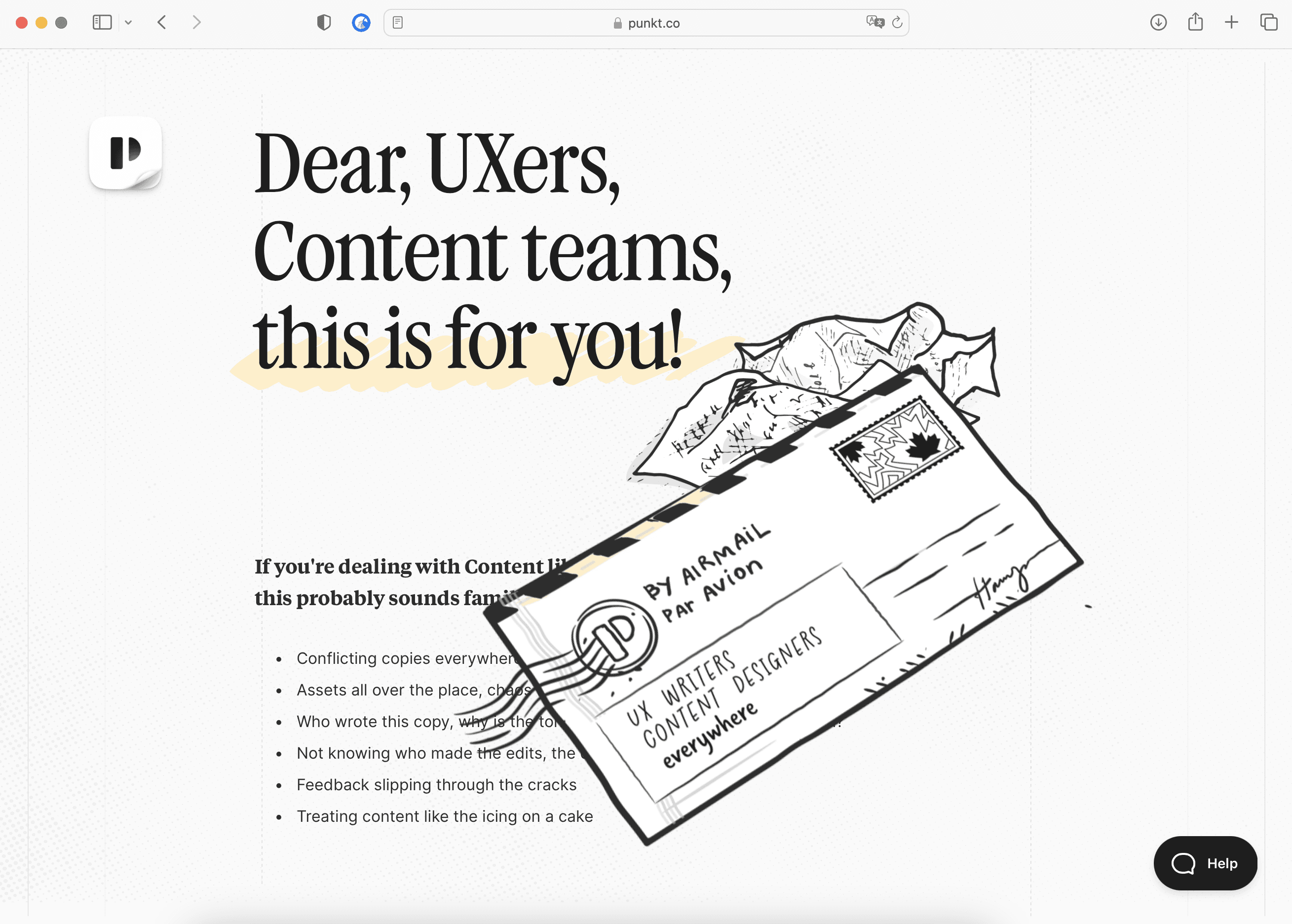
Punkt is the All-In-One UX Writing & Content Design Platform for Product/UX Teams
What sparked this project?
Well, since this is a personal venture, focusing on getting the product out is the big factor, ensuring consistency not just visually but also the way we communicate and how the product is perceived since it's targeting UXers, which is not a easy task :)
Who was on the team for the project?
We're a tiny team of 4. As the Founding and Solo Designer, the website is my mainly my job; I write, plan, design, hand draw all the visuals, and build it on Framer, wearing different hats. Letting the rest of the team take care of building the tools and features and managing our infrastructure.
Do you have some project metrics to share?
Team started of four
Solo Designer myself
100% Bootstrapped
Over 250 companies signed up
Fortune 500
Public Launch is in Q1 of 2024
4 years in the making with 2 pivots
100% remote, with 2 co-founders in Canada and 2 in Morocco

What is your approach to working on a project like this? Do you follow a specific process or framework?
Embarking on creating the Punkt Visual Language was an exercise in intentional minimalism and a deep focus on user experience. My journey began in Figma, where the constraints were set: only shades of black and pure white would be employed, an homage to the simplicity and directness of classic pen-and-paper. This decision was rooted in the philosophy that color. At the same time, a powerful tool, could often distract from the core functionality and design efficiency required in UX products, especially in the planning, research, and prototyping phases.
By sticking to a monochromatic palette, I forced myself and my audience to concentrate on the bare essentials of design elements, ushering in a raw focus on usability over aesthetic appeal. Parallel to this, I intertwined hand-drawn elements, initially crafted in Procreate and later transitioning to Adobe Fresco, capitalizing on my iPad's capabilities as a hobbyist/ amateur calligrapher and doodler. This blend ensured the designs retained a personal, unique, and organic touch, often lost in digital visuals. The interplay between sophisticated design tools and the deliberate restriction of color nurtured a development environment where content structure and user engagement pathways received the undivided attention they deserved, spotlighting the very skeleton of UX design without the veil of full-spectrum color distraction.


What did the early versions of this project look like? What did you learn from this v1?
V0 and V1 followed trendy UI back in 2019. Trendy UI is good, but again, it's trendy, and if it's not serving its purpose, it will wear out quickly. It will feel overkill or just too shiny for some use cases, which we have seen over the past couple of years: stuff comes and goes, and as Designers, we don't have to mimic the aesthetics, but our job is solving problems through Design. V2 is completely based on elimination rules to keep only what matters to our users: no fluff or shiny objects without a rationale or goal.
'Embarking on creating the Punkt Visual Language was an exercise in intentional minimalism and a deep focus on user experience... By sticking to a monochromatic palette, I forced myself and my audience to concentrate on the bare essentials of design elements, ushering in a raw focus on usability over aesthetic appeal.'
What was the biggest challenge? Did any part of the project make you step out of your comfort zone?
Designing with a limited color palette, with no accent color, is super hard to address visual hierarchy and contrast and keep things easily digestible and scannable. I've gone through different iterations and user tests to validate the user flows and fix what needed to be fixed. As someone in the industry for 20 years, worked for the largest agencies in the world, as well as big companies, the challenging part is mainly confronting the overthinking factor. The more you get your feet wet, the more you overthink every little detail, questioning stuff from a small 1px stroke in an icon up to holistic view of a user/ business goal in a new feature. It's a real struggle but gets easier with real user testing and a gut feeling. Look at 37 Signals, how they are so unique and not followers, and also look at Apple and how they become globally known, even for not designers, as trendsetters and quality freaks.
How did you overcome this challenge?
A good balance of good design that solves the user need + matches the business goal, including fantastic copy, short, concise, and simple UX, is the winning formula; everything on top is just decoration unless it's really justifiable somehow.
What and/or who inspired you during the creation of this project?
37 Signals, Jason Fried and their book Shape Up
What was your biggest learning or take-away from creating this project?
Designing Punkt illuminated a profound realization for me: the true heart of any design endeavor lies in addressing the genuine needs and concerns of the target audience. While aesthetic components and intricate features can enhance an interface, it's ultimately the user's experience and the value proposition that shapes the product's success. Punkt emphasized the crucial nature of consistent UX and the art of conversing with the users in the most relatable and humane manner. This user-centric approach revealed that most companies overlook a critical element in design: the power of UX Writing or, as it's more contemporarily termed, Content Design. Unlike traditional content writing, which can often prioritize form over function, Content Design underscores the importance of tailoring written content to elevate usability and user engagement.
Many interfaces are visually appealing but fall short in their communication with the user. This lapse in clear, effective, and human-centric communication is precisely what we aimed to address with Punkt. Our focus on Content Design was not just about stringing words together; it was about crafting narratives, building trust, and facilitating effortless interactions, ensuring that users felt seen, understood, and valued every step of the way. The biggest takeaway from Punkt was a reinforced belief in the pivotal role of well-crafted content in shaping superior user experiences.
Can you point out a detail in the project that might go unnoticed but you’re particularly proud of?
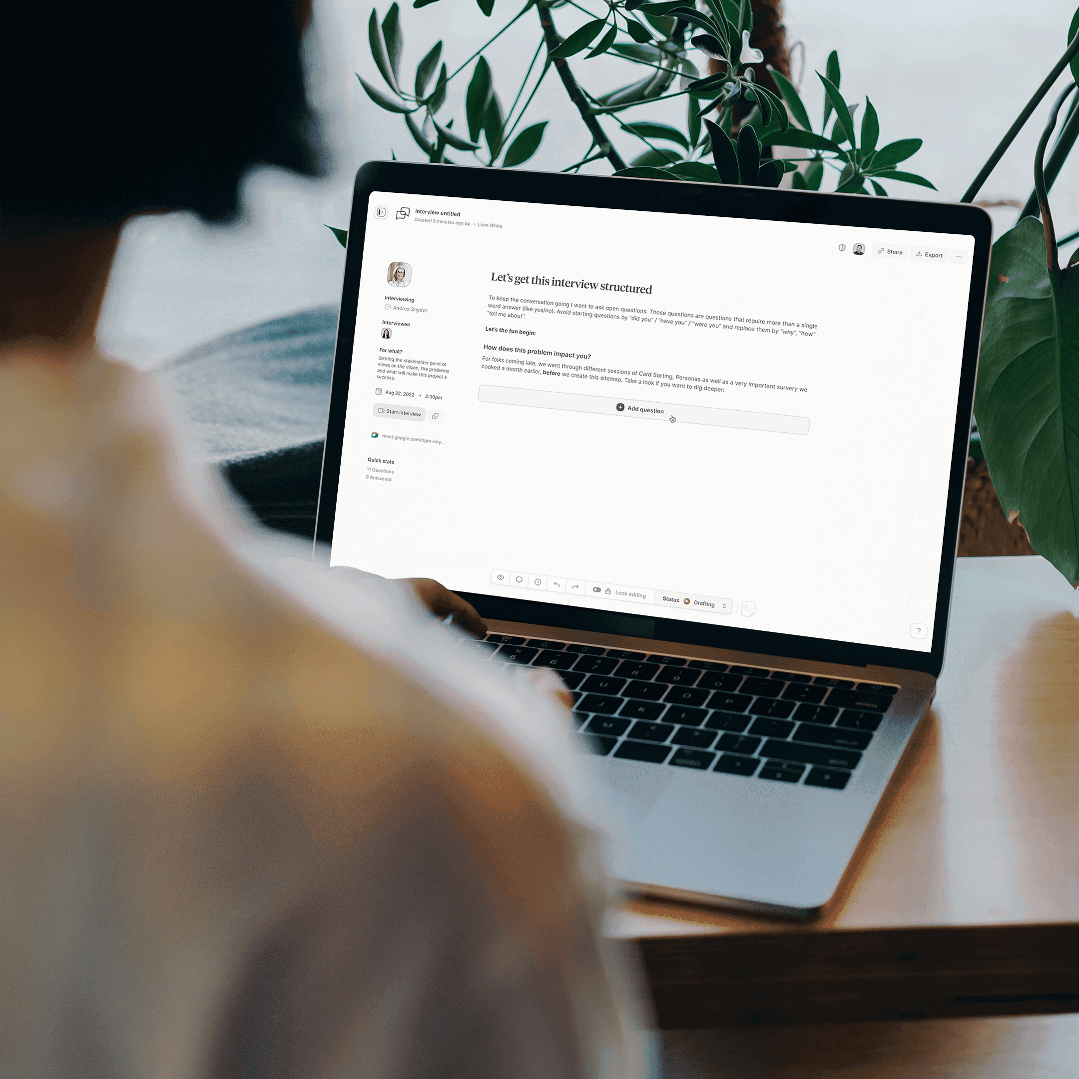
It won't go unnoticed, but I tried to have unique visuals for every tool, screen, or action to enhance the already well-crafted, concise, and 100% fluff-free copy. I also enjoyed designing a huge set of icons; each category serves a purpose in the design system and keeps everything consistent and tied together.
'Don't get overhyped with trends; master the basics, know what you're good at, and learn how to communicate ideas. We're not bohemian artists; we're problem solvers, and our tool is design.'
Which part of this project consumed the most time or energy?
When we first started working on Punkt (which we used to call Kopy and Kontent), the idea of "UX writing" wasn't really known. We were ahead of our time, trying to sell a very specific tool in a market that didn't know they needed it yet. Most of our effort went into doing a lot of research. I spent years collecting information, learning, and trying out different design ideas, seeing what big and small companies were doing. I kept up with the latest fads, throwing out what didn't matter, and focusing on what was truly important to make a strong product or design, especially for software. This wasn't just about gathering facts. I was determined to really understand what makes a user experience genuinely good and useful, making sure we built our tool the right way, not just the popular way.
What was the result of this project?
As I said before, we're not public yet, but so far so good, we have in our beta testing big names alongside our waiting list that we can't wait to roll in.
Where was the project created? What do you enjoy about working there?
Gear: Mbp's 16 M2 Max, Mba 13 M2, Studio Display, iPad Pro M2, Airpods Max, ... I guess that makes me an Apple fanboy isn't it 😜
If this project had a soundtrack, which one would it be?
Which tools did you use to create this project?
Software Tools: Design: Figma, Framer, Adobe Illustrator/Fresco Animation/ Video: Adobe AE, Lottie, Rive, Screen Studio Inventory of
Content: Coda
Planning: Notion and Linear Writing: Ulysses, TextSoap, Grammarly
Coding: VS Code Collaboration: G Chat, G Meet, Tuple
What are you currently working on, and what's next?
Currently adding the final touches on the website V2. Next launching the product to the public by moving out of the private beta.
Who or what are you inspired by lately? Any current influences that you find are seeping into your work
A mix of Rippling CEO Parker Conrad + 37 Signals CEO and CTO Jason Friend and David Heinemeier Hansson + Linear CEO Karri Saarinen
If you could give your younger self one piece of advice about navigating the design world, what would it be?
Don't get overhyped with trends; master the basics, know what you're good at, and learn how to communicate ideas, and rationale as it's equally important as your shiny Aqua buttons back then; without explaining why you used this font instead of something else, your design and value won't matter much. Additionally as UX/ UI whatever the naming/ title, learn the business aspect of the industry, we're not bohemian artists, painters, we're mainly solving someone's problems and our tool is: design.
From the maker