About the project
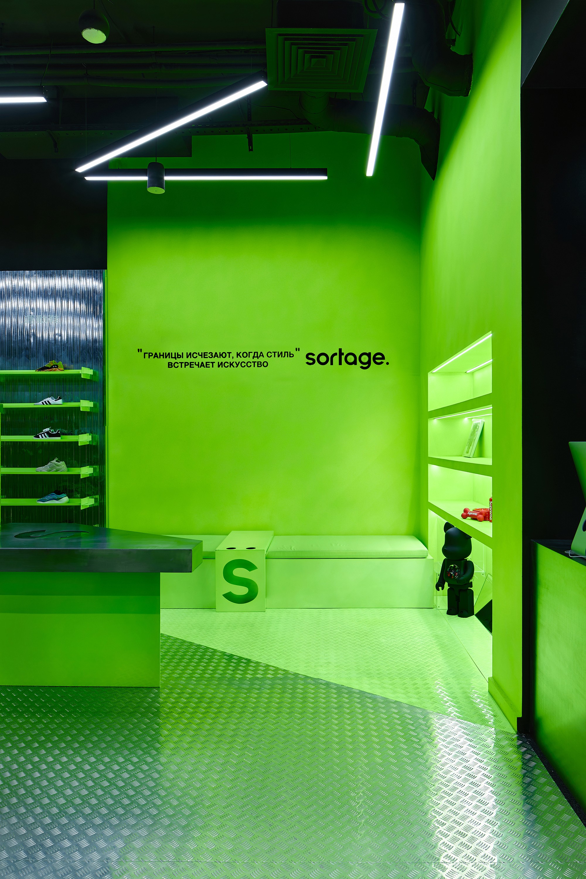
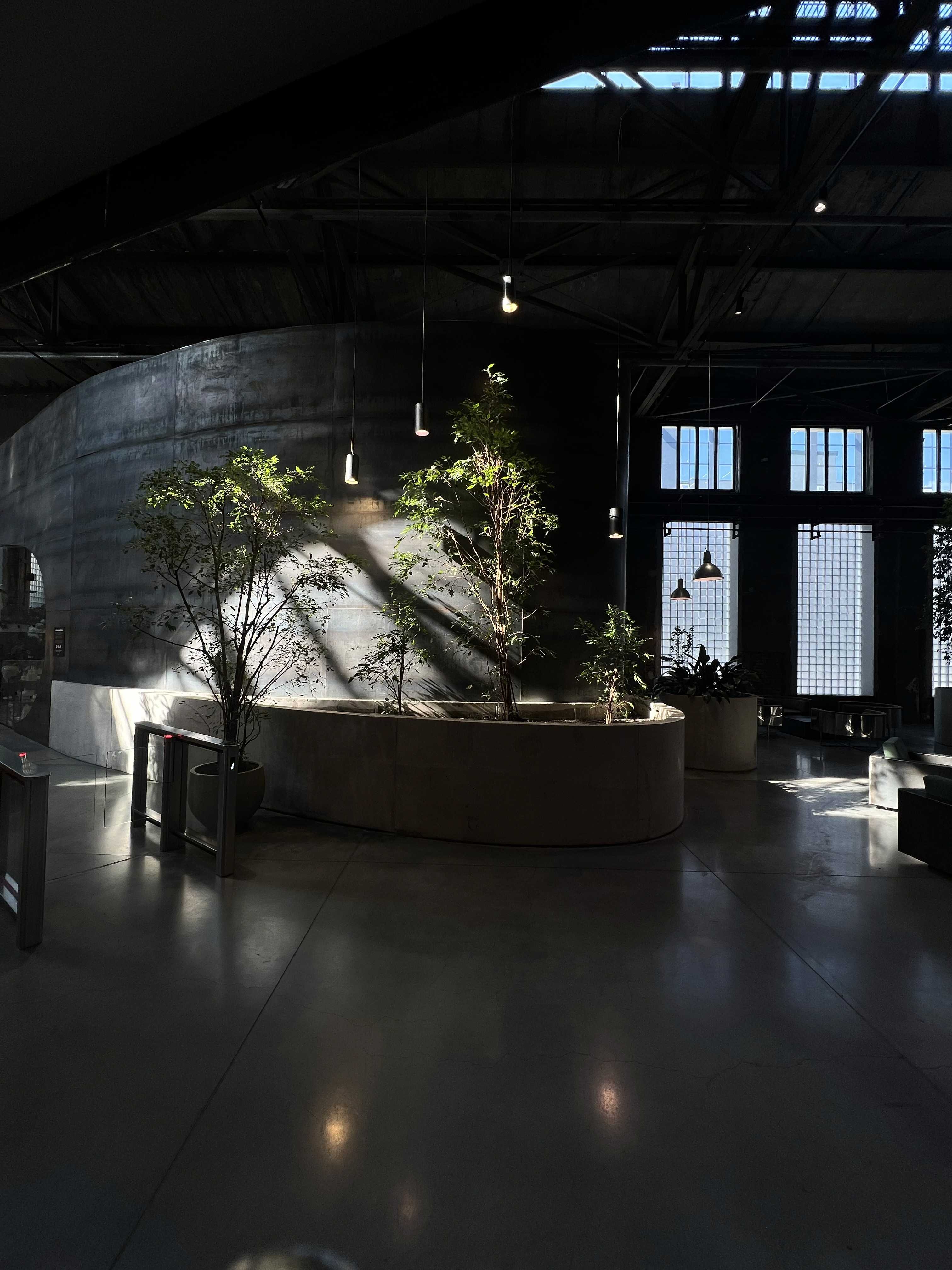
SORTAGE 2.0, the evolution of style and innovation. Space where brutalist architecture interior design meets high fashion, where black and fluorescent green collide, and where the ordinary transforms into the extraordinary.
What sparked this project?
The inception of SORTAGE 2.0 was a direct response to the overwhelming success of the inaugural SORTAGE store. Celebrated for its unique blend of street culture, high fashion, and artistry, this retail space captured the attention and praise of many. With the foundation laid, we were inspired to elevate this concept, paving the way for the birth of SORTAGE 2.0.
What makes this project distinctive from our usual undertakings is manifold. While our ethos always centers on innovation and distinctiveness, the journey of SORTAGE 2.0 presented a nuanced challenge. We needed to retain the essence and identity of the original while infusing it with novel elements. The bold incorporation of metallic reflective surfaces, highlighted by the quintet aluminum sheeting and a generous inclusion of stainless steel retail equipment, marks a deviation from our regular designs. It's a reaffirmation of our dedication to push design boundaries. SORTAGE 2.0 stands not only as a showcase of our design acumen but also as an embodiment of our relentless pursuit to remain leaders in modern design trends.
Who was on the team for the project?
Gleb Kirenkov – Director and Chief Architect, Designer, NDA Design Studio
Sergey Baturevich – Designer, NDA Design Studio
Pavel Yakushev – Head of a Construction Company
Do you have some project metrics to share?
70 square meters, 1.5 months of repair work, 1.5 months of NIGHT repair work (no sleep =)), Gleb Kirenkov gave up cups of coffee and switched to caffeine drips=)), vast experience in finding unique colors of interior paints, as well as several tones of steel furniture stainless steel

What is your approach to working on a project like this? Do you follow a specific process or framework?
We adhere to a common structure for working on interior designs, such as gathering examples into a shared moodboard. However, Gleb Kirenkov also leverages his personal experience from the past – Gleb was previously the founder of the first Russian tech clothing brand, NAMELESS. This helps him offer unique solutions for brands related to fashion. In addition to this, our studio is taking a new approach to creating moodboards. We don't just collect examples from completed projects by colleagues in the world of architecture; we generate examples in neural networks – using AI as a modern, fast, and realistic sketchbook.
Furthermore, the head of NDA design studio, Gleb Kirenkov, has experience in implementing interior objects made of metal and concrete. Gleb previously founded two workshops for developing and manufacturing furniture and interior items from metal and concrete. All of this allows us not only to come up with unique images of future interiors but also to confidently bring them to life. In terms of the rest of our approach, it's typical for developing working drawings, which are subsequently used for renovation work. Additionally, we work in the BIM system Rewit, which allows us not only to create 2D drawings of spaces but also to view them in 3D with all engineering elements.


What did the early versions of this project look like? What did you learn from this v1?
The inaugural SORTAGE store, though distinctive for Moscow, lacked the execution quality seen in the evolved SORTAGE 2.0. With a tight budget for the initial store, our inspirations stemmed from designs we saw in South Korea and some European interior studios. Reflecting upon this as we embarked on the SORTAGE 2.0 journey, we aspired to infuse more intricate elements. However, budgetary limitations persisted. Determined, we aimed to craft an industrial design edged with high fashion, transforming construction aesthetics into a stage for the brands gracing the SORTAGE 2.0 storefront.
'This experience became a shining example of how persistence and a willingness to step outside the boundaries of conventional methods can lead to a successful outcome.'
What was the biggest challenge? Did any part of the project make you step out of your comfort zone?
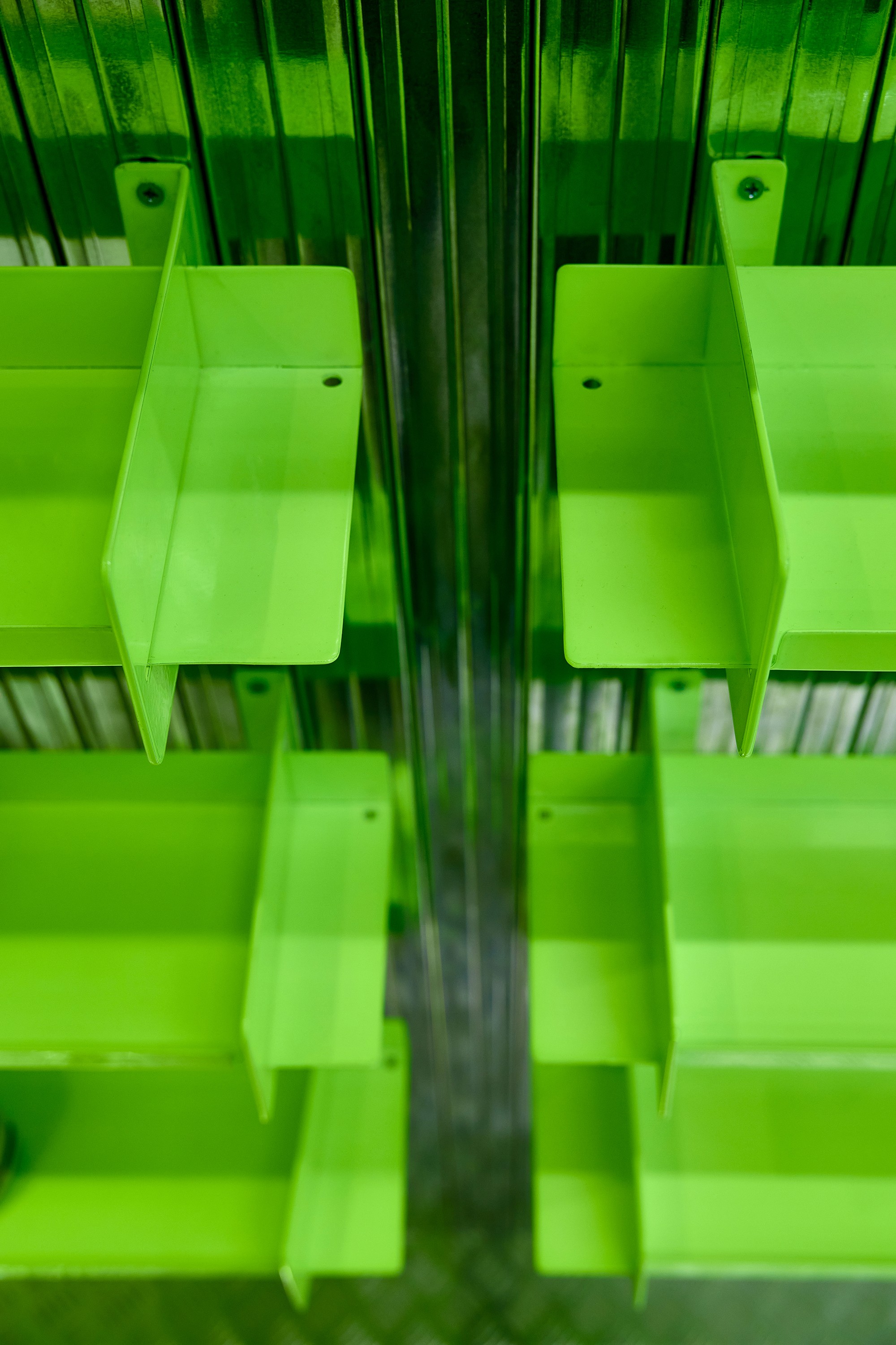
The most significant challenge Gleb Kirenkov encountered in the SORTAGE 2.0 project revolved around finding the ideal fluorescent color. This task propelled him beyond his comfort zone, prompting him to re-evaluate traditional methods and solutions.
The journey began with a visit to an automotive enamel production facility. Immediately, Gleb voiced concerns about the overpowering odor common with fluorescent paints. But rather than encountering predictable responses, he was met with an unexpected solution. He received advice to blend VGT RAL 6038, an atypical fluorescent paint, with yellow fluorescent paint (VGT) to achieve the desired shade. With syringes and a roller, Gleb blurred the line between painter and artist through experimentation. After many attempts, the team finally found the stunning fluorescent hue they were looking for
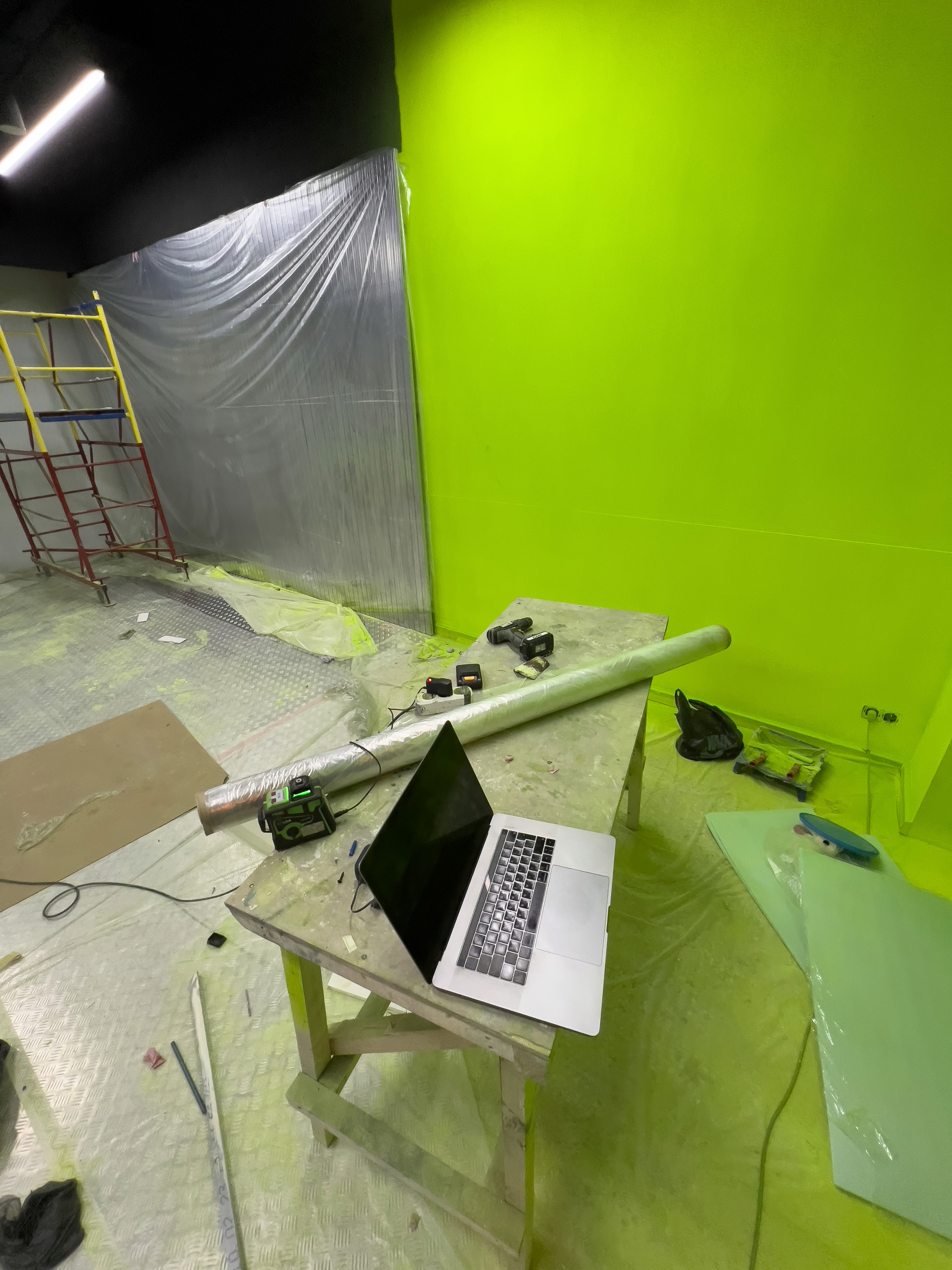
But the challenges didn't cease there. Repainting the store wall from white to yellow and then to fluorescent green became an intricate nighttime operation, designed to prevent daytime store disruptions. As the final touches loomed, tensions escalated. An unpainted segment obstructed the installation of quintet aluminum sheets and Knauf decorative wall panels. With pressing deadlines, the team ventured into repainting. Their first attempt, using a roller for the white base and spraying the green, resulted in a mottled appearance. Disheartened, Gleb nearly relinquished hope. Yet, fortune favored the persevering. An offer emerged to spray-paint the wall white and promptly overlay it with fluorescent green. At long last, the wall radiated the brilliant fluorescent hue that had been so elusive.
This odyssey underscored the power of persistence and going beyond conventional boundaries. Ultimately, SORTAGE 2.0 materialized as a luminous, one-of-a-kind retail space that consistently garners admiration from its visitors.
How did you overcome this challenge?
Gleb Kirenkov overcame the challenge of fluorescent color through creative experimentation and persistence. It was important not to settle for standard solutions but to explore alternative paths. The key factor in overcoming this problem would be perseverance and confidence that the right solution would be found. Experiments and failures are part of the process, and it's essential not to be disheartened but to learn from them. The main thing is to maintain passion for the project and belief that the outcome will be unique and impressive.
What and/or who inspired you during the creation of this project?
We inspiration from the unconventional yet practical thinking of architects and designers from South Korea, as well as the significant influence of architect Rem Koolhaas and his architectural firm OMA/AMO. We are also in awe of the unconventional thinking of Germany's GONZALEZ HAASE studio and the creativity and versatility of the French designers at PAF Atelier
What was your biggest learning or take-away from creating this project?
We realized that we wanted to work more in the styles of modernism, constructivism, and deconstructionism. We appreciate the brutalist aesthetics, geometric forms, and lines. Additionally, we want to convey the idea that creating a unique space doesn't necessarily require the use of premium materials; you can utilize what is often hidden from view. We live in an urban environment, in urban jungles, and while in the past people perceived spaces made from natural materials resembling their evolutionary memory of caves – stone, wood, etc., now there's no need to fear transferring the engineering and construction aesthetics of urbanism into interior spaces, whether it's a store interior, public space, or private residential apartments.
Can you point out a detail in the project that might go unnoticed but you’re particularly proud of?
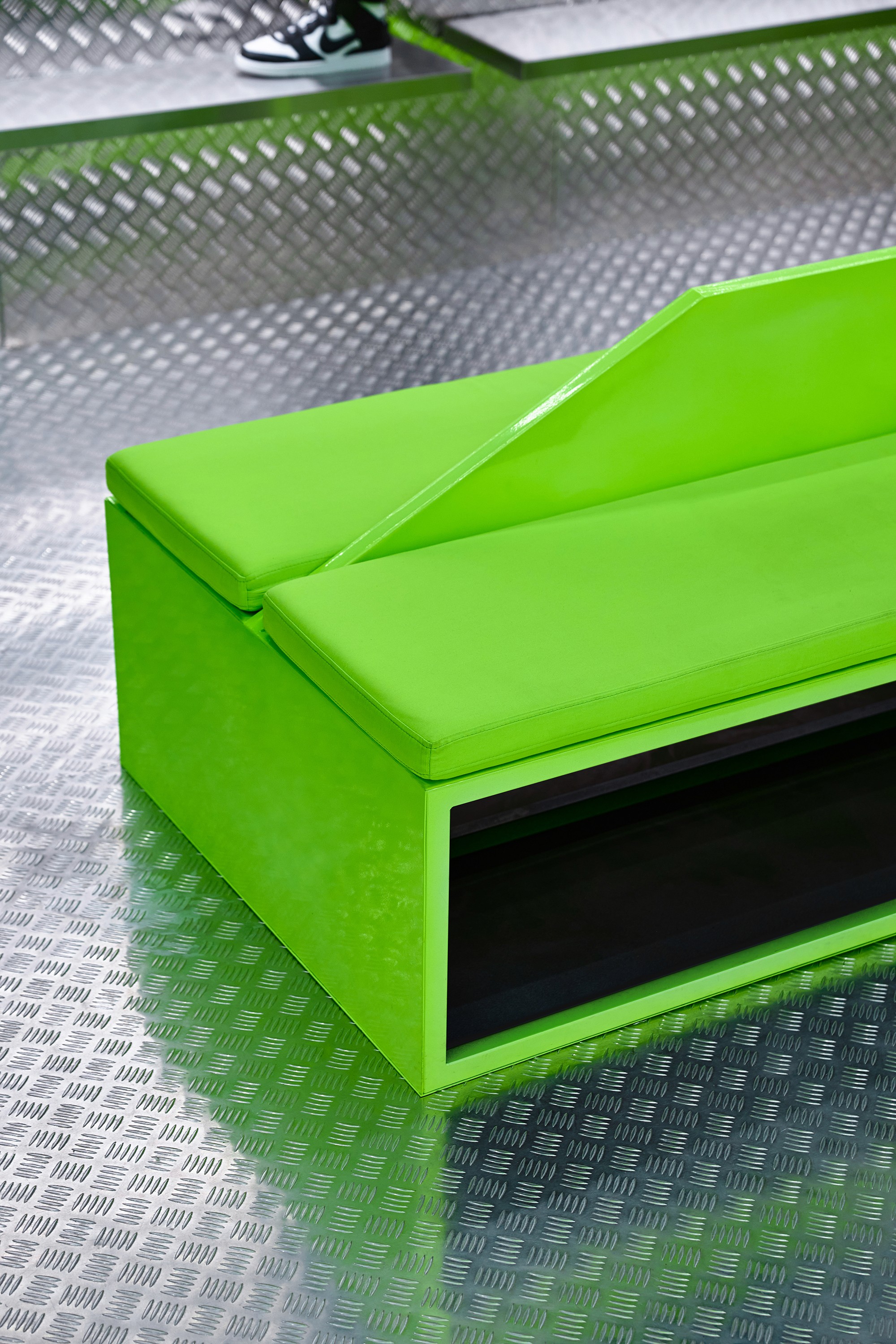
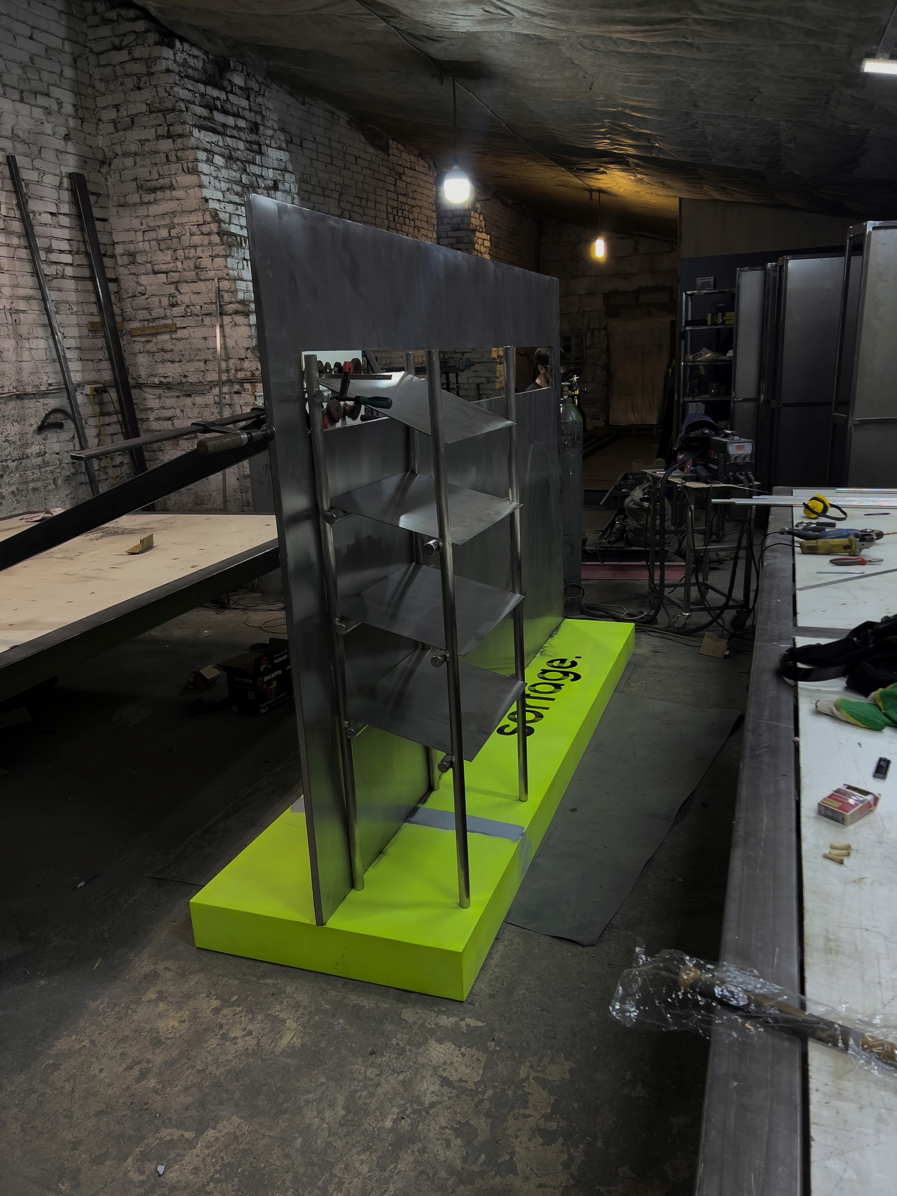
People often overlook the design of retail equipment, such as our design of stainless steel clothing racks, where even the simple concept of two stainless steel pipes not meeting in a classic manner but intersecting and connecting with sheet stainless steel material is unique. Additionally, a significant detail is the hand polishing of stainless steel. Most designers aim to preserve the factory finish of the material, giving it a medical cleanliness and sterility. However, over time, such material loses its sterility due to the appearance of scuffs and scratches. We noticed that in South Korea, they deliberately hand-polish stainless steel not only linearly but also in a circular method. They also add spots and streaks - this makes the material vibrant and gives it a specific concept and aesthetics of life
'Talk more, listen more, be more specific in your conversations, engage with competitors – this fuels your creativity, your healthy competitive drive.'
Which part of this project consumed the most time or energy?
Undoubtedly, painting the corner in fluorescent green took the most time. The search for the material and a contractor who could produce the paint in the exact shade matching the color of the retail equipment took a week. Applying the paint took several nights of experimentation - the color is very finicky.
What was the result of this project?
The result was unique, no less unique than the interior and retail equipment design solutions of the multi-brand store SORTAGE 2.0 - recognizability! There were cases when you get into a taxi and the driver understands which store you're going to with just a mention of the color and materials. And for the client, the most important thing is the result of our work, that they stand out among their competitors with a consistent style and reflection of the SORTAGE brand's DNA. Our goal in continuing to work with SORTAGE is to help the store not only develop as a retail location and trading platform but to become a brand and aspire to the level of KITH
Where was the project created? What do you enjoy about working there?
"Our workspace is no less unique than our solutions – we are based in the creative cluster Supermetal, a former industrial space transformed into a creative hub where various designers, content creators, and local brands are represented. We constantly communicate with each other and exchange ideas and examples that we've seen in the global information space about design and culture. This is our little island of freedom, if you know what we mean. It allows us to stay human.
Which tools did you use to create this project?
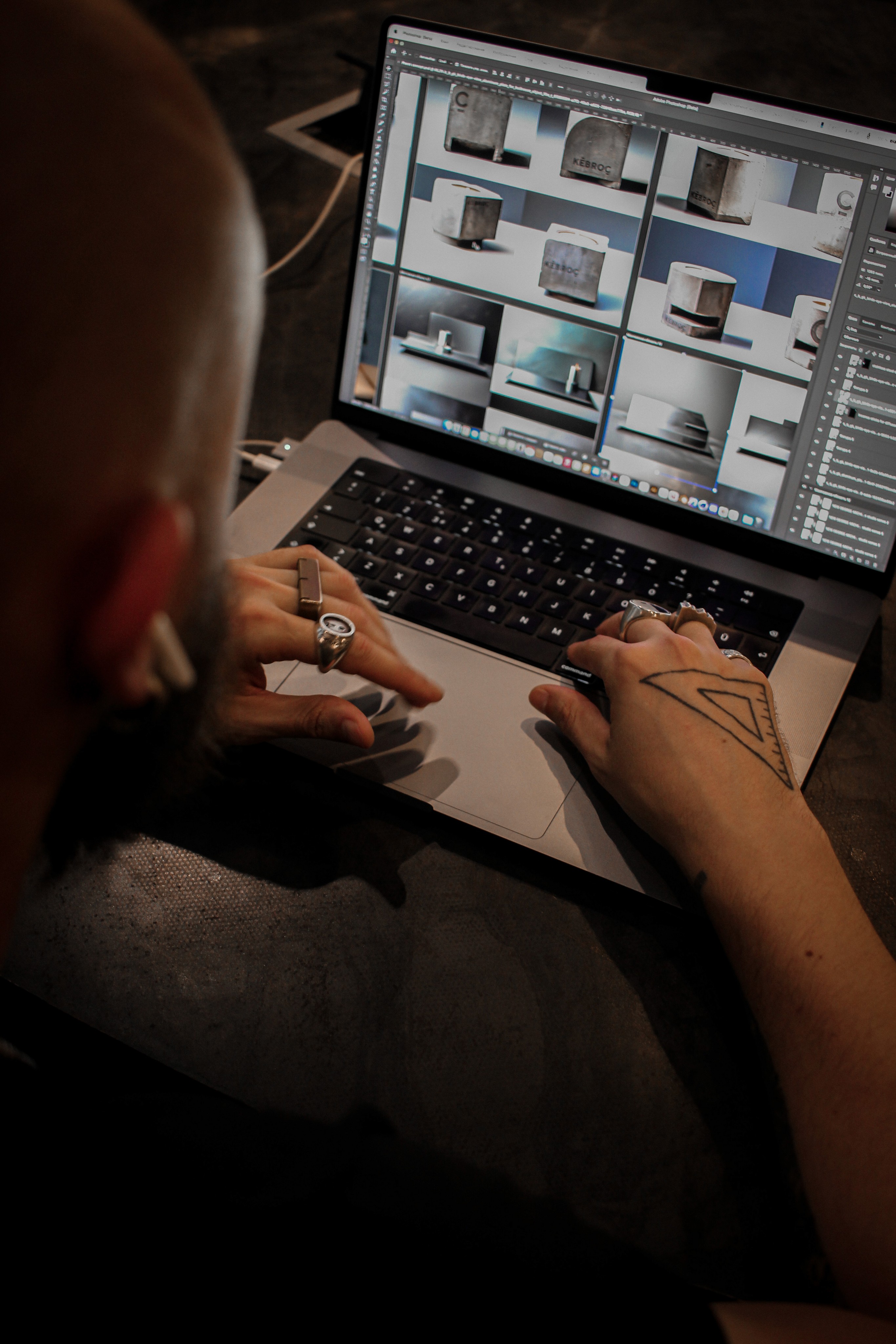
We work with BIM systems, specifically Autodesk Revit. It's an excellent modern solution that allows us to design not just 2D drawings but also render them in 3D projections, navigate through 3D spaces, similar to old PC games. Additionally, it enables us to connect subcontractors for engineering systems and communications through cloud systems to bring the project to perfection. We create project visualizations in 3DS MAX and refine them using Adobe Photoshop.
What are you currently working on, and what's next?
Currently, we are working towards expanding our operations worldwide. While we already have projects in Greece and Dubai in our portfolio, despite the modern realities, we aim to bring only constructive contributions to the world. Our goal is to create, build, and produce things that will enhance people's lives, make them more aesthetically pleasing and convenient. Gleb Kirenkov is currently a guest designer at one of the furniture manufacturing companies, where he is developing a furniture line. The studio is also in negotiations for the construction of a logistics center outside of Russia. We don't just want to create a logistics hub for shipping and receiving goods; we also want to establish a socially and culturally significant place. A great example of this can be found in Europe, where Bjarke Ingels, the architect bureau BIG, created an Ecological Waste-to-Energy Plant—a perfect illustration of how to create an industrial facility that benefits society, culture, and leisure activities.
Who or what are you inspired by lately? Any current influences that you find are seeping into your work
Perhaps it may sound strange coming from an architect in Russia, but lately, Gleb often quotes Martin Luther King, saying, "I have a dream." The reason behind this is that Gleb has distant Ukrainian roots and has spent some time living in Ukraine. He wants to change the world, even if it's within the confines of a single object or interior. He aims to change it for the better, providing freedom for self-expression, not only for himself but for everyone. That's why we have a dream.
If you could give your younger self one piece of advice about navigating the design world, what would it be?
Talk more, listen more, be more specific in your conversations, engage with competitors – this fuels your creativity, your healthy competitive drive. And most importantly, don't be afraid to start from scratch because before you begin anew, you've gained significant experience, made many mistakes, and drawn the right conclusions if you've decided to start everything from scratch.
From the maker