About the project
Women’s Republic is both a non-profit organization and an online magazine dedicated to celebrating women from every corner of the globe. Conceived by its founder as a unique platform, it empowers women of diverse backgrounds to discuss societal challenges head-on. Distinct from many contemporary magazines, Women's Republic encourages contributors to passionately delve into any woman-related topic or societal concern they're drawn to.
The organization stands strong in its commitment to inclusivity, extending its arms to transgender women and those identifying as non-binary. My task was to build a sustainable brand strategy and a cohesive visual identity, which included redesigning the existing logo and making collaterals. Designed and ran multiple very successful social media awareness campaigns.
What sparked this project?
I stumbled upon Sai on Twitter and was immediately captivated. Sensing an opportunity to enhance the current visuals, I sent her a DM.
Who was on the team for the project?
Imran Latheef
Sai Seshadri - Writer
Vaani Sai - Writer
Do you have some project metrics to share?
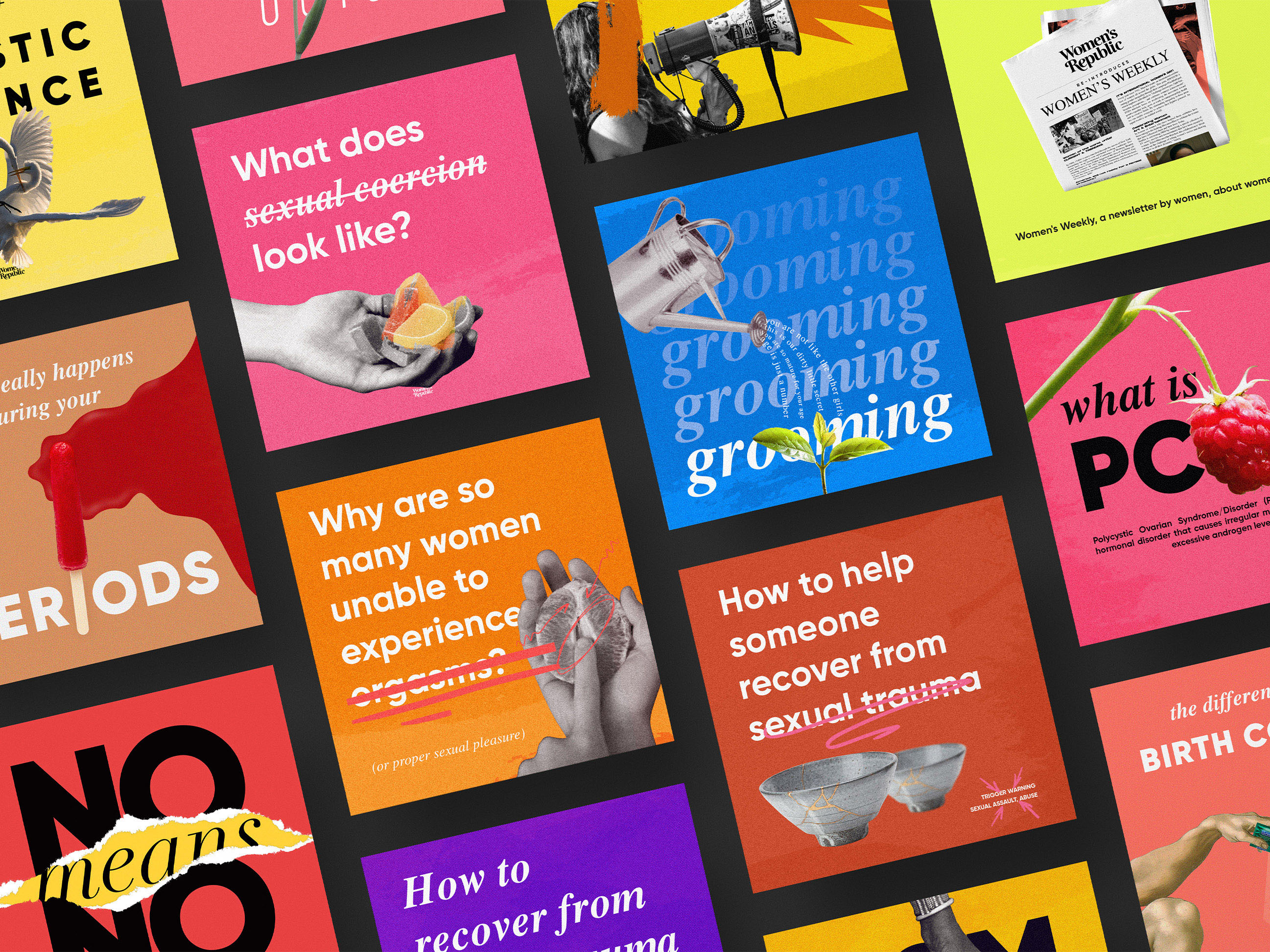
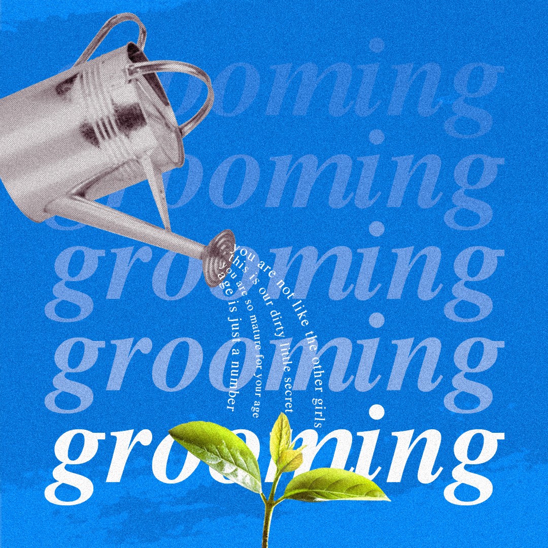
Around a month on the initial visual identity and then spent the year designing various social media posts and campaigns. Several posts gained viral traction, and it was deeply rewarding to receive poignant feedback, especially from victims of SA.

What is your approach to working on a project like this? Do you follow a specific process or framework?
I don't think there's any specific process for me on a project like this. However I try to be mindful and ensure I conduct thorough research before releasing any visuals, especially considering the weight of the subject matter


What did the early versions of this project look like? What did you learn from this v1?
For a glimpse of the original version, please check the Behance project link provided. I felt the initial logo didn't fully resonate with the brand's core values and essence.
'By pausing and consulting women in my circle for their insights, I ensured the content resonated authentically and respectfully.'
What was the biggest challenge? Did any part of the project make you step out of your comfort zone?
Navigating the delicate balance of visually representing sensitive subjects without crossing into the realm of insensitivity.
How did you overcome this challenge?
By intentionally pausing the design process to consult with women in my circle, I gathered diverse perspectives that ensured the visual content was both authentic and respectful of the issues at hand.
What and/or who inspired you during the creation of this project?
Inspiration for this project was drawn from various sources such as the Women's March, standout projects by COLLINS, the evocative visuals of 'The Color of Pomegranates' (1969), and a few others.
What was your biggest learning or take-away from creating this project?
Power of effective visual design.
Can you point out a detail in the project that might go unnoticed but you’re particularly proud of?
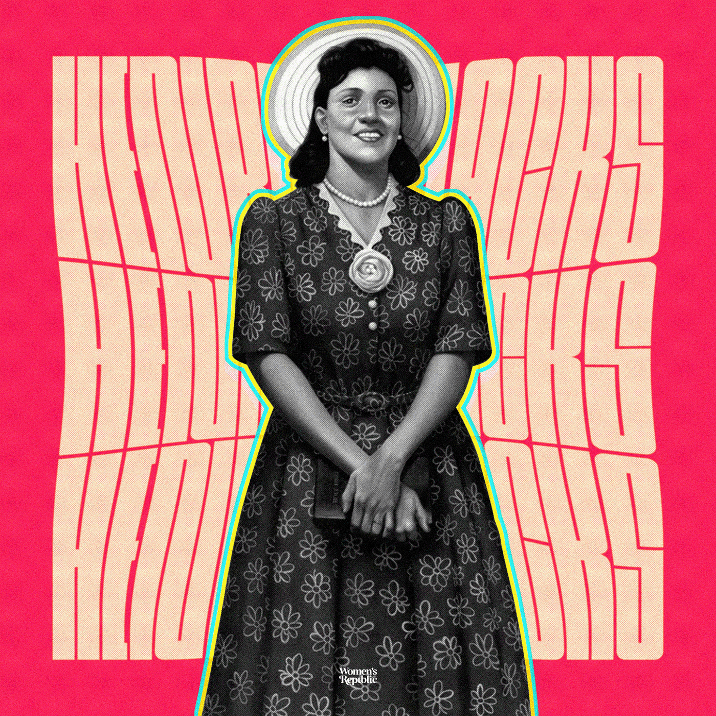
I'm not sure if it was unnoticed but I am really proud of the work I did with type to visualize FGM.
'Biggest challenge has been navigating the delicate balance of visually representing sensitive subjects without crossing into the realm of insensitivity.'
Which part of this project consumed the most time or energy?
The design of the wordmark, and particularly the task of visualizing FGM, was a significant challenge. Looking back, it might appear straightforward, but the process was intricate and thoughtful.
What was the result of this project?
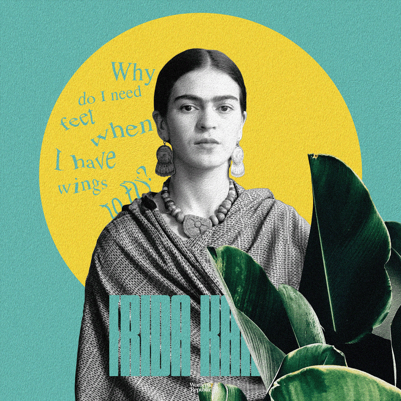
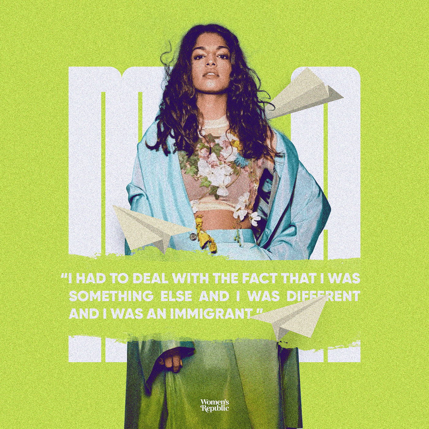
Our work with Women's Republic achieved notable recognition, being featured on World Brand Design. Furthermore, our content resonated powerfully with audiences, with posts like this and this going viral on Instagram. This positive traction also paved the way for another significant project: Liberated Bodies. More than generating leads, I am really happy that our work had a momentary yet profound positive impact on many.
Where was the project created? What do you enjoy about working there?
An old Macbook Air 13", Adobe CC, Pencil & paper for sketches.
If this project had a soundtrack, which one would it be?
Which tools did you use to create this project?
Photoshop for collages, most of the social media posts, posters, mockups. Illustrator for the wordmark. Pencil & paper for sketching.
What are you currently working on, and what's next?
Currently working as a visual designer at Humanitec. I'm open to work on projects big or small.
Who or what are you inspired by lately? Any current influences that you find are seeping into your work
This project a friend of mine did https://www.instagram.com/p/CwR7zJ0Axc7/?igshid=MzRlODBiNWFlZA== This branding for Book Lover https://www.behance.net/gallery/146526669/BookLover-Branding
If you could give your younger self one piece of advice about navigating the design world, what would it be?
Learn about other disciplines and take inspiration from everywhere.
From the maker